Redesigning the Online Loan Application
Every private education loan Sallie Mae writes starts on one form. I was the primary designer on its redesign — thirty modules of it — and I carried that work through a corporate rebrand, a change of executive leadership, and a feature the business asked for mid‑stream.

The company's front door, and everyone had a stake in it
In early 2018 I was handed the redesign of Sallie Mae's Online Loan Application — internally, OLA. It is the application for the company: every education loan product runs through it. Undergraduates and their parents, cosigners applying on someone else's behalf, graduate students, MBA and medical candidates, law students studying for the Bar — all of them fill out the same form, on a phone at a kitchen table or on a desktop in a school's financial aid office.
That reach is what made it a hard design problem rather than a big one. A form this load-bearing collects stakeholders the way a hull collects barnacles: Legal owns the disclosure language, Compliance owns where that language appears, Marketing owns the brand, Sales owns pull-through, and a fifteen-year-old codebase owns what can actually be changed this quarter. Nothing about the redesign was going to be settled by taste.
The existing experience was aging and married to an inflexible, convoluted architecture. Working inside those constraints, the plan I drove was:
- Standardize every form element on proven, device-agnostic patterns, and modernize the visual experience in the process
- Transition the application onto the company's new brand, on the wider rollout's schedule
- Introduce real wins along the way — transparent, educational, simplifying — rather than a purely cosmetic pass
- Establish patterns the application could keep evolving into, so this wasn't the last redesign anyone could afford
- Ship an interim Return Borrower experience ahead of the full rebuild, on the business's request
An audit of what fifteen years of additions had produced
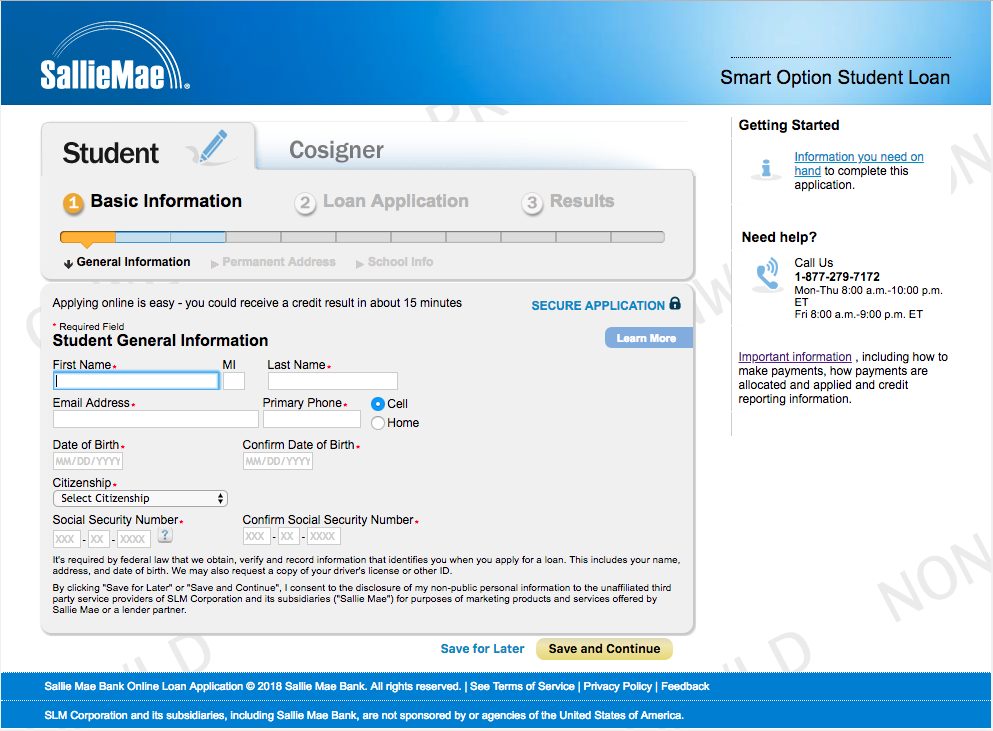
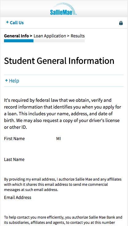
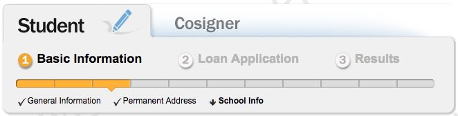
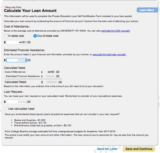
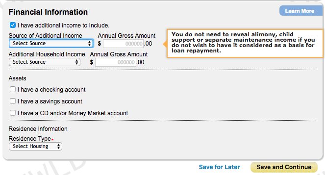
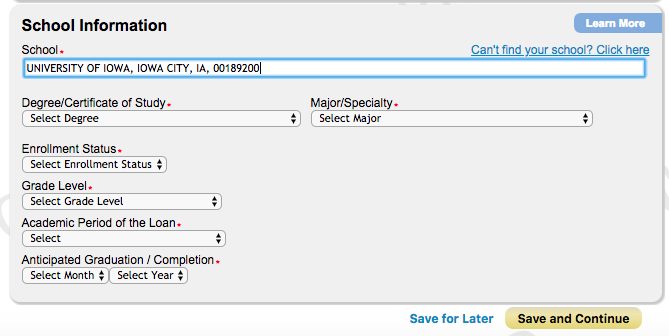
Before proposing anything I went through all thirty modules of the live application and documented them. The problems weren't stylistic. They were the accumulated residue of a form that had been extended by many hands, for many products, over many years — and they compounded on the smallest screens, where more and more of our applicants were.
 Enlarge
 Enlarge
 Enlarge
 Enlarge
 Enlarge
 Enlarge
 Enlarge
Read together, the audit gave me the argument I needed with stakeholders. These weren't thirty separate design problems; they were the same six problems repeated thirty times. Fixing them once, as a system, was cheaper than fixing them thirty times as screens — and it was the only version of the work that would still be standing after the next set of requirements landed.
Taking the smallest brief and getting the most out of it
I was directed to start with a reskin. Development capacity was committed elsewhere, and the appetite was for something visual and cheap. Rather than treat that as a ceiling, I treated it as the budget: what is the highest-leverage change available if I'm only allowed to touch presentation?
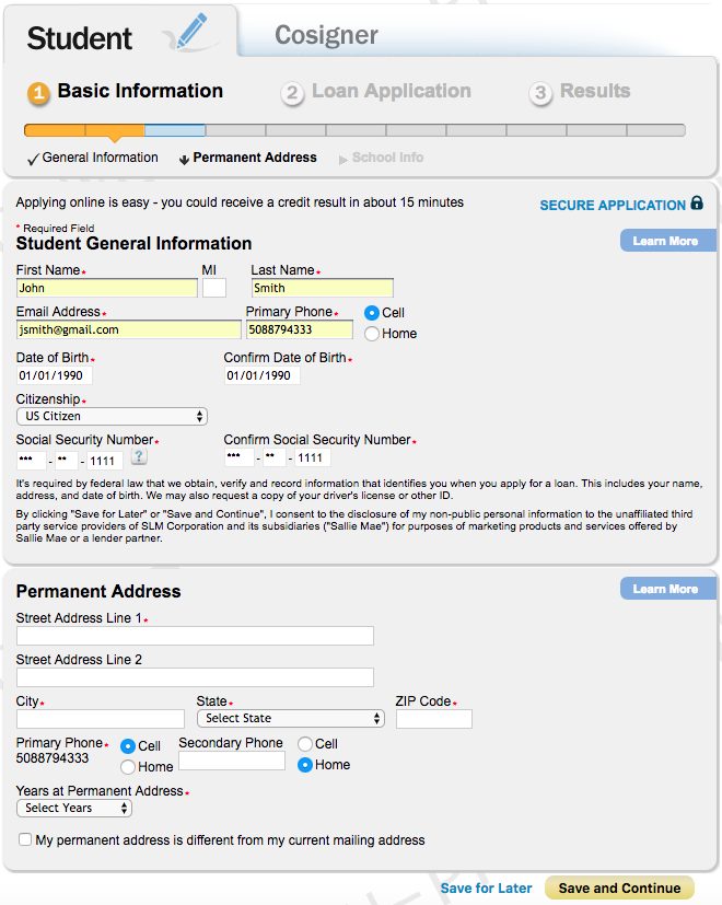
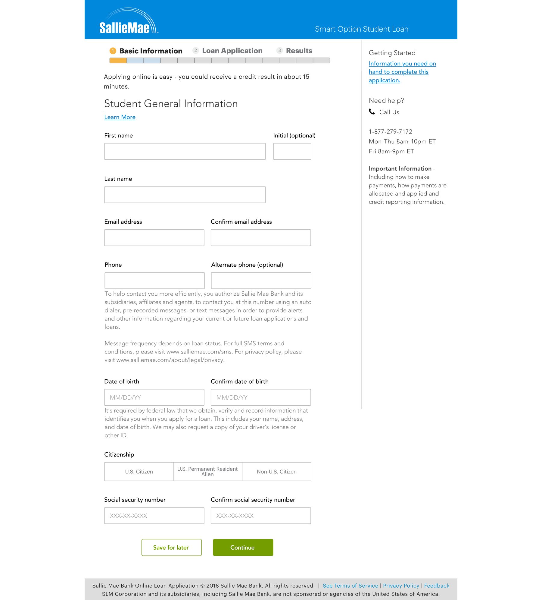
The answer was to stop designing screens and start designing the components underneath them. I standardized every input in the application — one height, one border treatment, labels above the field, placeholders that show format rather than repeating the label — and put them all on a single layout grid so the eye travels down one column instead of hunting across four. Required-field asterisks came out in favor of a single statement at the top of each module. The citizenship dropdown became a segmented control, because three options presented as three options is faster than three options hidden behind a click. Every component was specified responsively, so the same module reflows correctly on a phone instead of collapsing into unlabelled text.
The reskin held the legacy brand exactly as it was — the blue header, the wordmark, the green calls to action — while replacing everything structural underneath it. That was deliberate: it kept the proposal reviewable by stakeholders who had not agreed to a brand conversation yet, and it isolated the variable I was actually testing.
I delivered updated designs for all thirty discrete application pages in this system, plus the responsive behavior for each.
 Enlarge
“Evolve OLA” — folding the work into a rebrand I didn't plan for
Partway through, the ground moved. The executive team and management structure changed, the development roadmap grew, and the company committed to a full rebrand for 2019, with a schedule of its own. A reskin in the old brand was now a reskin with an expiry date.
Rather than let the redesign be shelved or restarted, I proposed we move it into the rebrand program — internally, “Evolve OLA.” The interaction patterns, grid, and component behavior carried over unchanged; only the color, type, and iconography were new. It was the same argument from the audit, applied organizationally: the rebrand needed the application restyled anyway, so the restyling might as well be the redesign we'd already validated. That reframing is what kept two years of work alive through a leadership change, and it's what put the new patterns in front of customers on the company's own timeline rather than waiting for a rebuild that hadn't been funded.
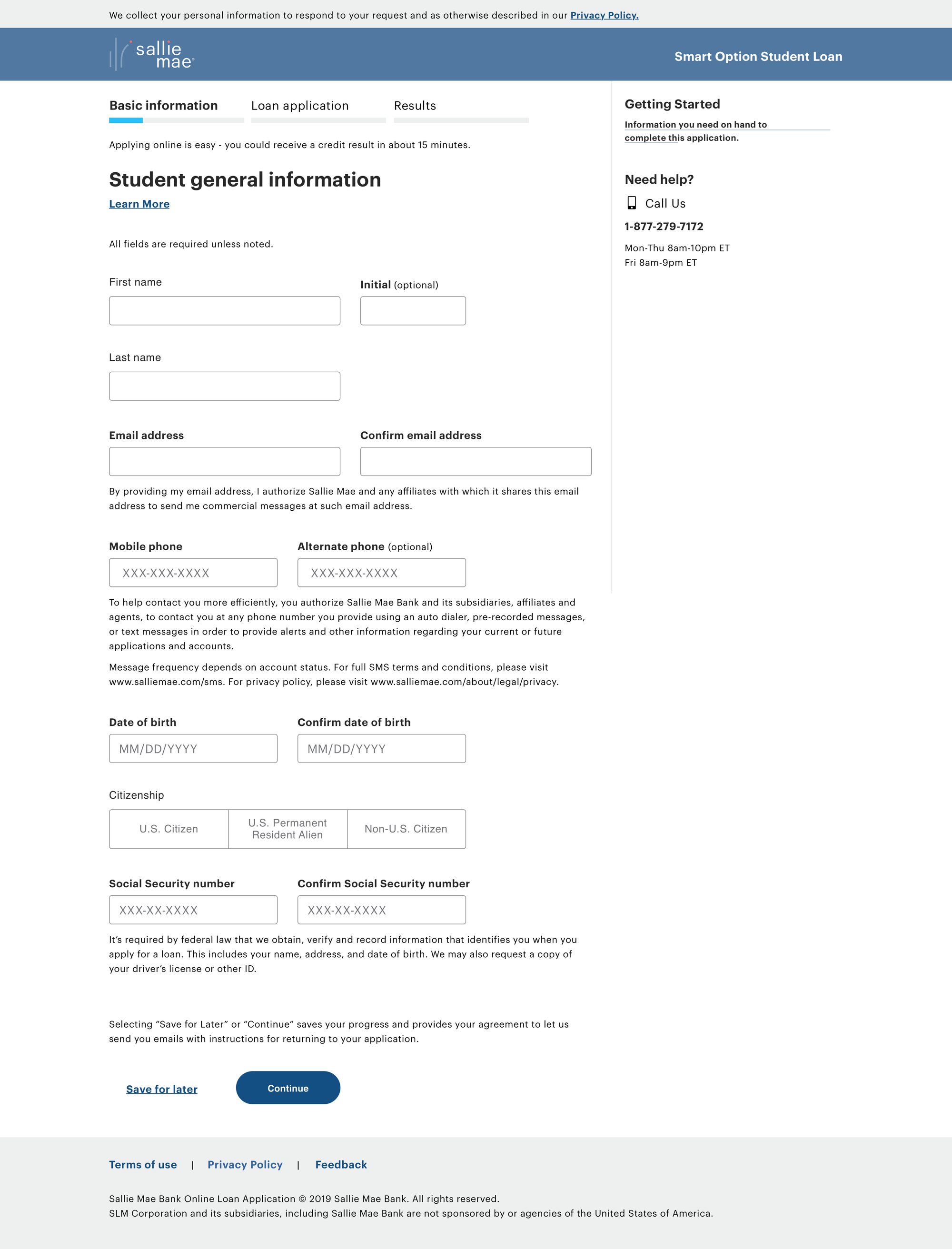 Open full size
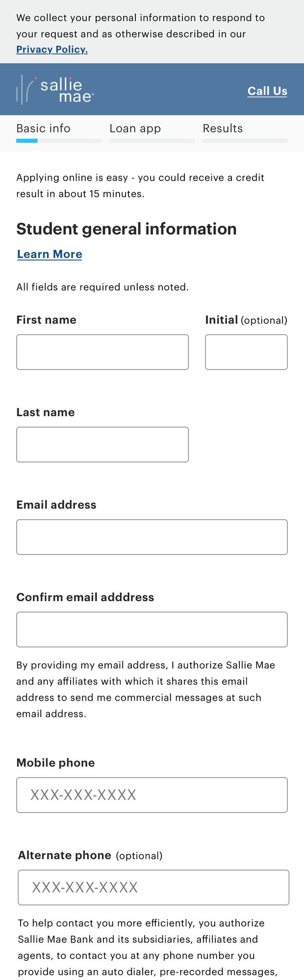
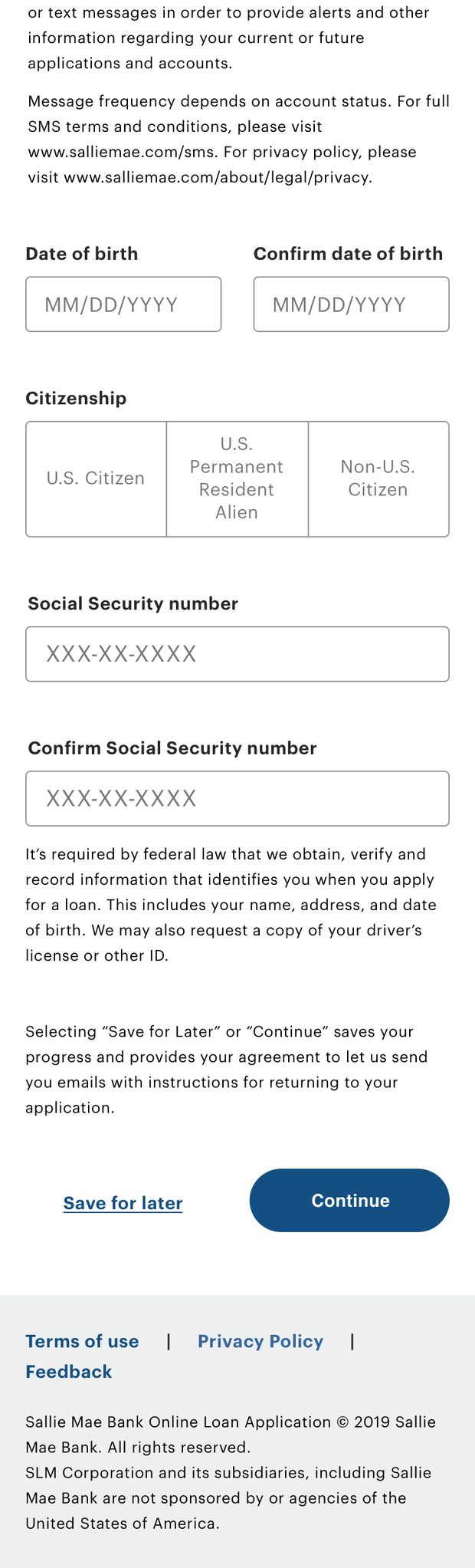
The same module, on a phone
Every component was designed at both ends of the range rather than adapted afterward. On a phone the grid resolves to one column, the segmented control stacks its labels rather than truncating them, disclosure text stays attached to the field it qualifies, and the primary action keeps its size and prominence instead of shrinking to fit. Compare it to where the legacy form landed on the same screen, at the top of this page.
Testing the thing people actually get stuck on
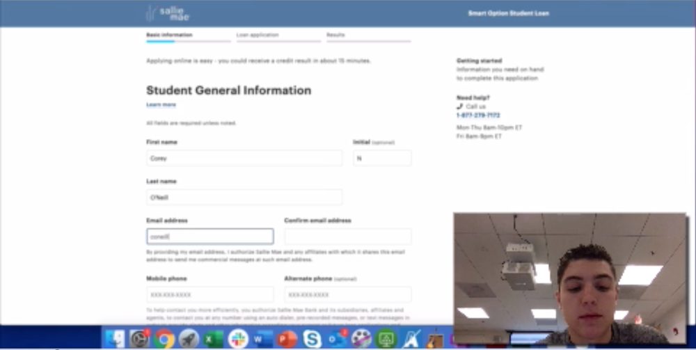
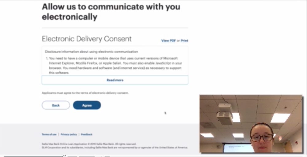
Testing ran continuously alongside the design work rather than as a gate at the end of it — unmoderated sessions through UserTesting.com for reach, and moderated sessions in our onsite lab when I needed to ask why. The lab sessions are where the redesign earned its keep: watching a real applicant read a disclosure out loud tells you things a click-through funnel never will.
 Enlarge
 Enlarge
Synthesis
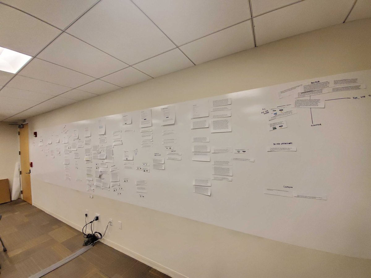
I ran synthesis on paper, at wall scale. Every relevant utterance from every session came off the recordings onto a printed strip, and the strips got grouped on a corridor wall until the categories named themselves. It's slow and it takes a hallway, but it produces something a two-hour readout never does: a physical artifact any stakeholder can walk up to, read a real customer sentence off of, and argue with.
 Enlarge
 Enlarge
What the wall said
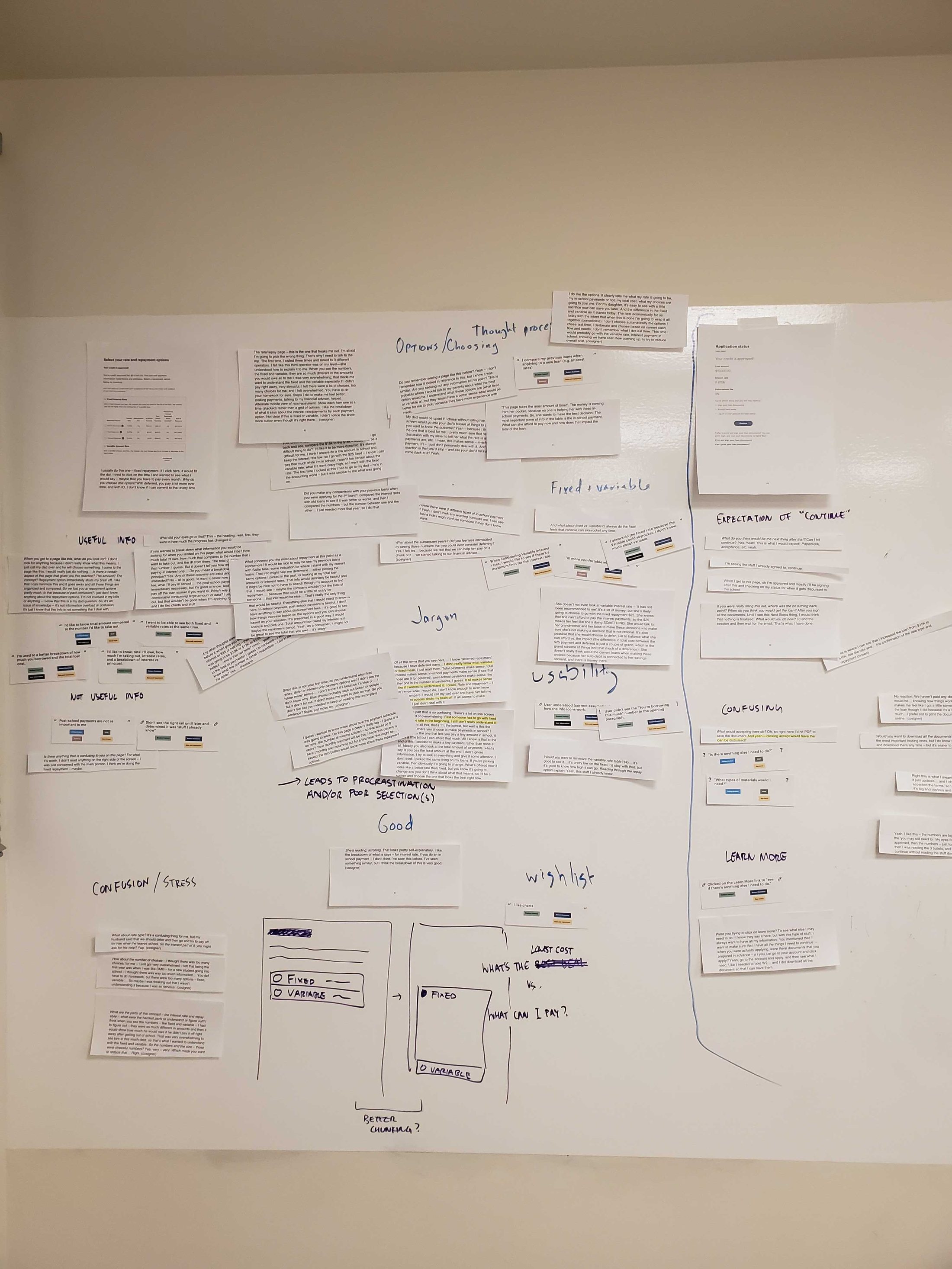
The groups that formed were, in my handwriting on the wall: Useful info and Not useful info. Options / choosing and Thought process. Fixed & variable. Jargon. Usability. Confusion / stress. Expectation of “Continue.” Learn more. Good. Wishlist. Three of them decided real design work:
-
01
Jargon leads to procrastination and poor selections. That arrow is drawn on the wall, because it's the mechanism behind the abandonment the business cared about. Applicants who didn't understand a term didn't ask — they guessed, or they stopped. The fix was plain-language framing attached to the control it describes, and “Learn more” treated as a real, findable affordance rather than decoration.
-
02
Rate and repayment is two questions, not one. The sketch at the bottom of the wall separates a single overloaded fixed-versus-variable screen into two chunks, with the questions people were actually asking written between them: “What's the lowest cost?” versus “What can I pay?” Those are different decisions with different answers, and merging them was making both harder.
-
03
“Continue” doesn't promise what people think it promises. An entire cluster formed around what participants expected to happen after the next button — paperwork? acceptance? a credit pull? Ambiguity at a commitment point is expensive, so button copy and the sentence above it became a deliberate design surface rather than filler.
The rate-and-repayment finding is also where this project met the other half of my work at Sallie Mae: the interaction model from the Loan Estimator — choose an option, watch the total move, read in plain language what the choice costs you — graduated into the application's rate and repayment step, for approved borrowers looking at their own numbers.
Explorations past the funded scope
A brief that ends at “restyle it” produces a product that needs restyling again in three years. So alongside the deliverable work I kept a running set of explorations for the version after the one we were building, and used them to argue for the architecture changes that the reskin couldn't reach on its own.
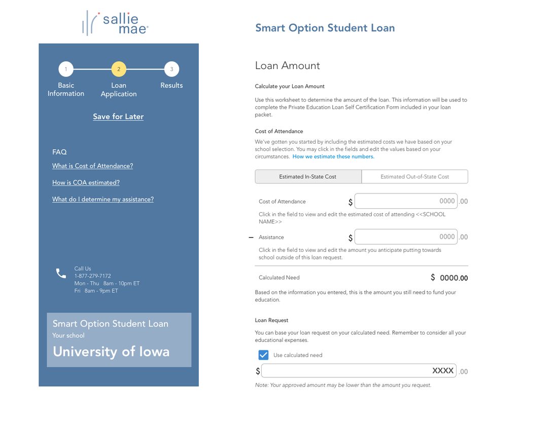
The clearest of these moves progress out of the content area entirely and into a persistent left pane — where it can hold the step, a durable Save for later, the FAQ entries relevant to the current module, contact details, and a confirmation of which product and school this application is even for. It answers the “where am I?” problem from the audit and the “what does this word mean?” problem from the research with the same piece of structure, and it gives the loan amount module room to prefill the school's cost of attendance and let the applicant edit it in place, instead of handing them a worksheet.
 Enlarge
Return Borrower — a feature the business needed before the rebuild
Mid-stream, stakeholders asked for a departure from the scheduled redesign. Returning customers — a student borrowing again for sophomore year, a parent cosigning for a second child — were being run through the full application as though the company had never met them. The business wanted that fixed before the rebuild landed, in the new brand, on a short timeline.
This is the part of the project I'd point at for adaptability. The ask arrived as a disruption; I took it as leverage. A small, self-contained flow in the new brand was the ideal place to prove the more conversational, customer-centric voice I wanted for the application as a whole — a proposal that was much harder to sell across thirty legacy modules than it was across five new screens.
Working the flow out first
The screens weren't the hard part; the branching was. A returning applicant might be a student, a cosigner, or a parent taking full responsibility. They might be borrowing for the same school and program or a different one. Their existing loan might have one cosigner or three. Each combination changes which data can be trusted, which has to be re-validated, and when the record can be saved at all.
So I mapped it, in the open, with the unresolved questions written directly into the diagram — which fields require re-validation, at what point we can start saving, whether financial information is needed for a returning cosigner, whose email the access code goes to. Putting the open questions on the artifact rather than in a separate list is what made the reviews fast: product, legal, and engineering could each answer their own part without a meeting to divide them up.
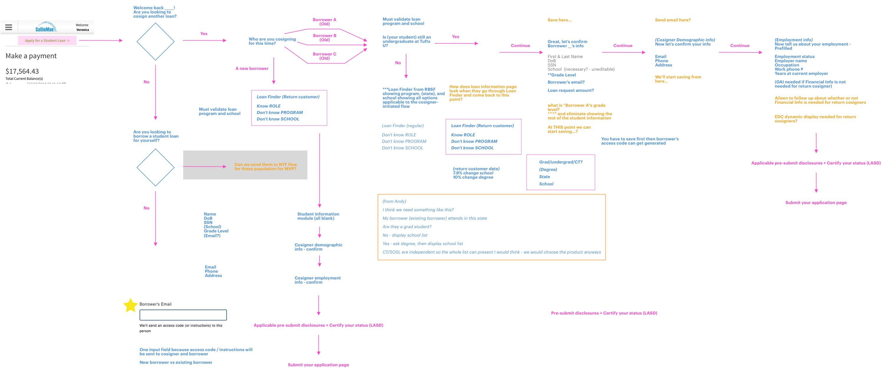 Open full size
The flow that came out of it
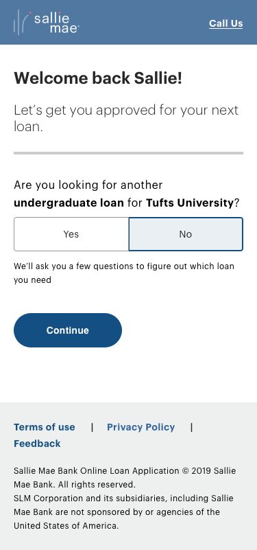
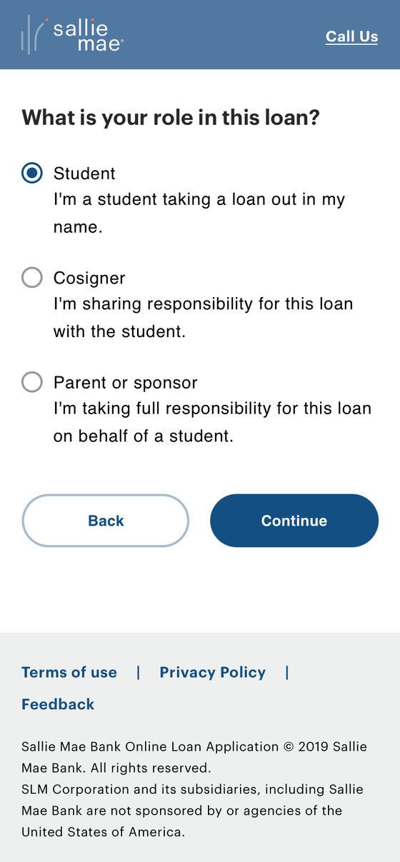
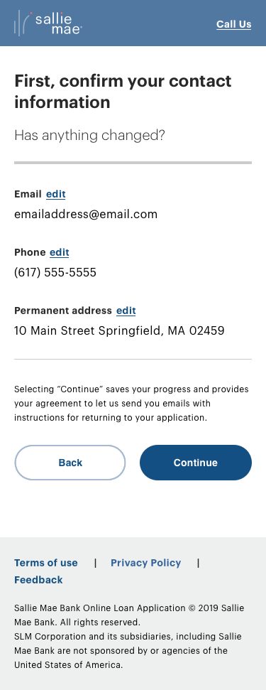
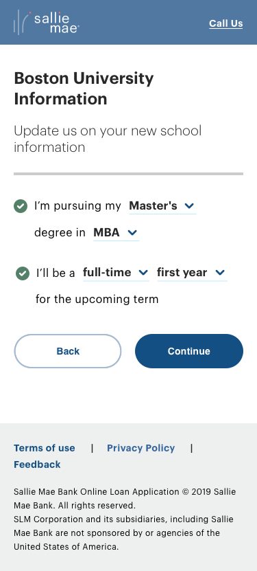
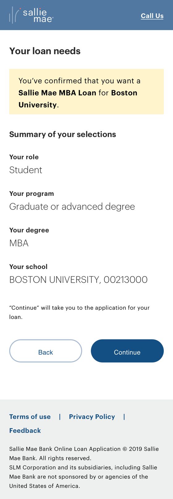
Five short screens replace re-running an application. It opens by using what we already know — “Welcome back Sallie! Are you looking for another undergraduate loan for Tufts University?” — and every subsequent screen either confirms something on file or asks exactly one question. Contact details are shown as values with an edit link rather than as a form to retype. School information is a sentence the applicant completes with inline dropdowns: “I'm pursuing my Master's degree in MBA. I'll be a full-time first year for the upcoming term.” The summary states plainly what was confirmed and what “Continue” will do next — the answer to that cluster from the research wall.
 Enlarge
 Enlarge
 Enlarge
 Enlarge
 Enlarge
What shipped, and what it changed
The updated application style went live in 2020, in the brand I had helped land it on. The part I'm proudest of isn't that launch — it's what happened three years after I left. Sallie Mae rebranded again in 2023, and the style and workflow decisions I made in 2018 are still underneath the application. Components designed to be restyled got restyled, by people I never met, exactly as intended — without the interaction model being reopened.
- Primary designer and owner of the outcome across the whole arc — audit, research, synthesis, design, testing, and the stakeholder presentations that got each stage approved
- Thirty discrete application pages redesigned on one standardized, responsive component system, replacing per-module improvisation
- The redesign folded into the corporate rebrand as “Evolve OLA” rather than shelved — two years of work preserved through a change of executive leadership
- Continuous remote and in-lab research, synthesized at wall scale into findings the whole organization could read off a wall and act on
- Return Borrower delivered on request as an interim experience, and used to establish the conversational, customer-centric voice for the application as a whole
- Live in 2020 — and still standing after the 2023 rebrand, three years after I left the company