The Loan Estimator, and a Lean UX Pilot
Sallie Mae's first full Lean UX cycle, run end to end on a cost calculator for the Smart Option Student Loan — the company's most popular product. I led the team through the process, the research, and the six design iterations it took to get there.

A calculator on a product page — and a process to prove
In early 2019 my team was asked to design a loan calculator for the Smart Option Student Loan product page. The company had largely finished its transition to SAFe Agile, and my team got approval to run this one differently: as a Lean UX pilot, end to end, to demonstrate the merits of the process and what its wider use could do for the organization.
That gave the project two goals running in parallel. The product goal was to help students and their parents understand what a private student loan actually costs, and how amount, rate, and repayment choice move that cost. The organizational goal was to introduce Jeff Gothelf's Lean UX Canvas to our project manager, product manager, and stakeholders, and use it to arrive at a solution that wasn't boxed in by the original ask.
Why this feature was uncomfortable
Showing borrowers cost numbers before they apply is not a neutral act inside a lender. Legal was wary of putting interest figures in front of customers before they'd entered enough information — credit history, for one — for those numbers to mean anything. Sales was wary of the opposite risk: showing people an unattractive total before they'd committed to the application at all.
Both concerns were legitimate, and neither could be settled by argument in a room. That's exactly what made this the right project for a Lean UX pilot: the process turns a stakeholder standoff into a testable question, and time spent on research and prototypes becomes the justification for the feature rather than a tax on it.
Starting with assumptions instead of a spec
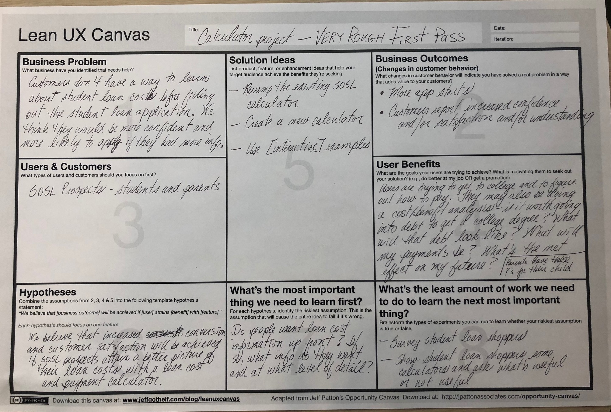
We ran the first canvas session with just the design team, on paper, in a room. The point of a rough first pass is that it's cheap to be wrong on it — we filled the eight cells with what we believed and labelled it accordingly. Its title, in my handwriting across the top: “Calculator project — VERY ROUGH FIRST PASS.”
 Enlarge
What the first canvas said
Business problem
Customers don't have a way to learn about student loan costs before filling out the application. We think they'd be more confident, and more likely to apply, with more info.
Users & customers
Smart Option Student Loan prospects — students and parents.
Business outcomes
More application starts. Customers report increased confidence, satisfaction, and understanding.
User benefits
Users are trying to get to college and figure out how to pay for it — running a cost/benefit analysis. Is it worth going into debt for a degree? What will that debt look like? What will my payments be? What's the net effect on my future? Parents are asking the same questions on behalf of their child.
Solution ideas
Revamp the existing SOSL calculator. Build a new one. Use interactive examples.
Hypothesis
We believe increased conversion and customer satisfaction will be achieved if SOSL prospects attain a better picture of their loan costs with a loan cost and payment calculator.
Riskiest assumption
Do people want loan cost information up front? If so, what information, and at what level of detail?
Least work to learn it
Survey student loan shoppers. Show them existing calculators and ask what's useful and what isn't.
What the canvas said after research
The canvas is only worth the meeting if it changes. Four rounds of lab sessions later, we revised it with the product and project managers in the room — and the revisions are the argument for the process. The business problem sharpened from “how much will my loan cost?” to “users want information specifically about their costs prior to applying”. Business outcomes picked up lower abandonment alongside more applications, and dropped longer borrowing term — an outcome the research never supported. And the question we most needed to answer moved from how much to borrow to what metrics does a customer need before they're ready to submit an application?
We also used the canvas to hand Legal and Compliance something they could work with: a deliberate MVP strategy that starts with basic calculator functions and evolves, and a commitment to bring them what tested well rather than what we hoped for.
Twenty families, three competitors, one recurring complaint
Competitive analysis
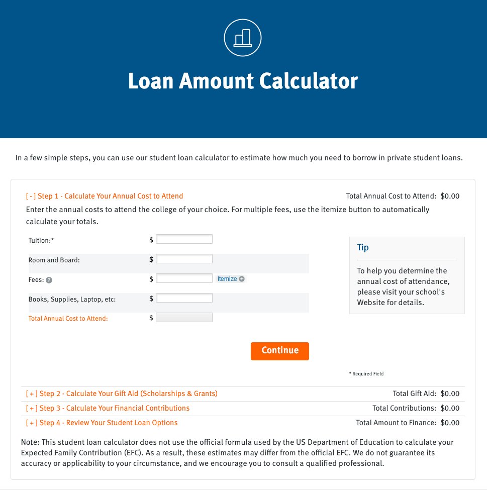
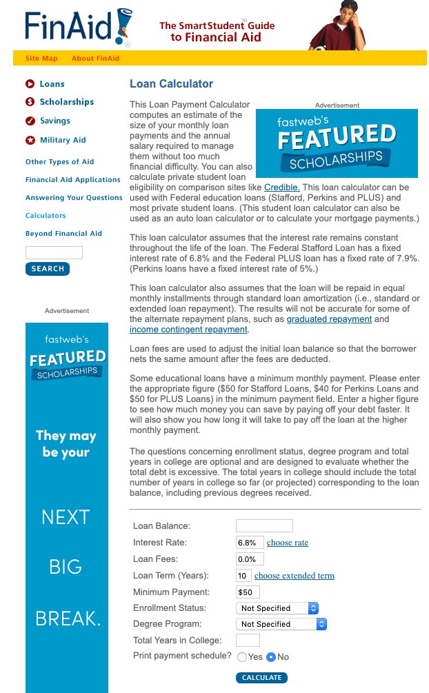
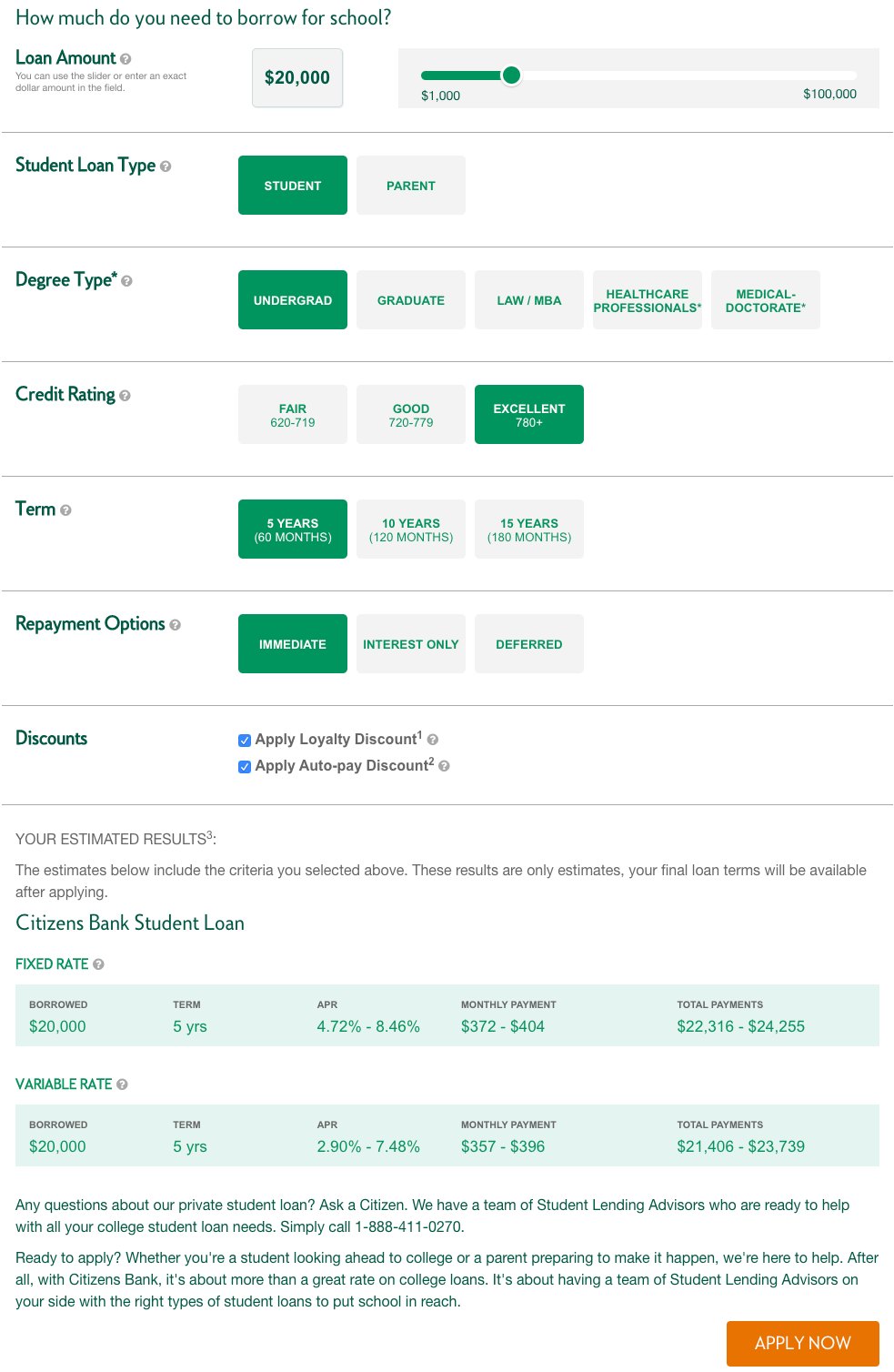
I pulled the loan calculators prospects were most likely to hit before they hit ours. Read together, they made the gap obvious: the market was full of tools that either asked for a great deal before telling you anything, or told you a great deal without helping you decide anything.
 Enlarge
 Enlarge
 Enlarge
Lab research with prospects
Alongside the competitive work, the team ran four rounds of moderated lab sessions with twenty participants over four months — parents of college-bound high school students, pairs of high school seniors with a parent, current undergrads, a grad student, and one borrower already in repayment. We showed them competitors' calculators, the calculator Sallie Mae already had, and asked where they expected to find this information at all.
Two barriers came back consistently, and they were not the same barrier:
- Parents arrived with mental models from mortgages and car loans, no working knowledge of how a private student loan differs, and information overload. They needed clarity — what makes this loan different from the loans they know.
- Students arrived with no mental model at all, no vocabulary for financial products (APR versus interest), and the same overload. They needed simplicity — fewer concepts, fewer choices.
The sharpest finding was about the rate itself. Sallie Mae published a range — fixed rates 5.49%–11.85% APR, variable 4.25%–11.35% — and prospects could not get past it. A range that wide makes estimating impossible, and nobody knows where on it they'll land. People stalled on the rate before they ever reached the questions that actually mattered to them: what the loan will total, and what they can do to bring that total down.
In their words
“Is there something in here that says, ok here's a hypothetical, you're gonna borrow 35k, here's scenario 1, what your numbers would be, scenario 2… like a car loan. I just want to know what the picture is going to look like with all 3 modes.”
Parent — unprompted appetite for a scenario tool
“Unless you can see a graph to compare student loans, I don't really know about fees. I'm new to this. If I'm lost, other people have to be lost… I don't know what I don't know.”
Prospective borrower — on comparison as a starting point
“When I go into a lender, I want to know the terms; the amount, the rate, the term. With so many features that I don't know, it adds too much complication.”
Prospective borrower — keep it simple
“Is there a way to do a soft check to figure out what my rate would be? So I actually have to go through this process and apply to find out? And then… that's a ding on my credit score also. Even if I decide not to do it.”
Parent — on the cost of finding out your own rate
Two rules that decided the whole design
Synthesis gave us the shape of the tool, and I've used the same two-beat structure since. It came out of one participant describing what he'd already built for himself: a spreadsheet with a rate range, so his kids could work out what a $15,000 loan would really cost them — in the worst case, in the best case.
-
01
Start with an example, not a form. Default to the simplest possible case, with the minimum number of inputs, clearly stated. The user sees under the hood — the simplest possible math — before they're asked to do anything.
-
02
Then let them make it their own. Once they've seen the example, let them play with a small number of variables: the fewest possible inputs, real-time updating that makes it obvious what just changed, information layered on to narrow the possibilities (a credit self-assessment instead of a hard pull), and the levers that reduce cost made explicit — in-school payments, term, auto-debit. Output stays two numbers: total cost and monthly cost.
That second rule is the answer to the rate-range problem. We couldn't give anyone their real rate without a credit pull, so we stopped trying. Instead of hiding the range, the tool makes it something you can move — pick a rate, watch the total move, and understand the shape of the decision rather than waiting for one authoritative number.
Testing the riskiest assumption before anyone built anything
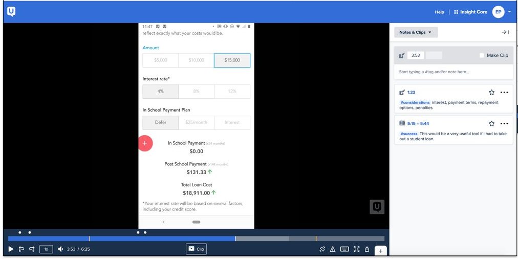
The canvas named the riskiest assumption — do people even want cost information up front? — so that's what the first round of testing had to answer. I built a clickable prototype in Sketch and ran it on UserTesting.com against both halves of the audience.
- Participants
- 10 testers — 5 aged 18–25, 5 aged 45–55.
- Scenario
- “Please imagine that you or your child are a high school senior researching private student loans before the start of freshman year at a four year college.”
- Task
- View the Smart Option Student Loan product page first and say what information matters when considering a private loan. Then click through the Freshman Loan Estimator prototype and describe how it might influence their research — and how it changes how they feel about taking out a private student loan.
- Results
- 8 of 10 found the tool helpful as-is for their research process — all 5 parent-age testers, 3 of 5 student-age. The 2 remaining student-age testers wanted to edit the inputs directly rather than choose from presets.
 Enlarge
The finding that answered Sales and Legal
The fear inside the company was that honest numbers would scare people off. They did produce shock — and the shock is precisely what people valued. Watching a parent and daughter work through a $15,000 loan at 8% out loud made the case better than any deck could:
“I know but that's taking out 15k and repaying 26k. And that's at 8%, not even 12. Geez that's pretty eye opening. So if I did this for 4 years… I'd end up paying over 30k of interest over 4 years. Oh god. I wouldn't have guessed interest would be that much. It's so…scary. I'm literally paying for another year of school in interest.”
Parent — seeing the total for the first time
“I love it, because that's the first time I've seen this, and it helps me get a visual of what this is, and now if I go to another website and they don't have that I guess I can't compare. This is exactly what I would be looking for.”
The same parent, immediately after — on where she'd go next
“Now that I'm getting educated I know what to ask, what to look for. It's helpful seeing this. It's like a car, if you have a down payment, here's what monthly payments would be.”
Parent — the tool as a teachable moment
“Hey, if you can spare 25 a month, the post school payment will be 133 vs 147. I think this is great… it helps to explain to someone who's younger what they're really paying for the loan.”
Parent — on the value of paying while in school
Transparency read as trustworthiness, not as a deterrent. The people we shocked didn't leave — they said this was the first lender that had shown them the picture, and that it was what they'd use to compare everyone else. That evidence is what moved the conversation with Sales and Legal from opinion to observation.
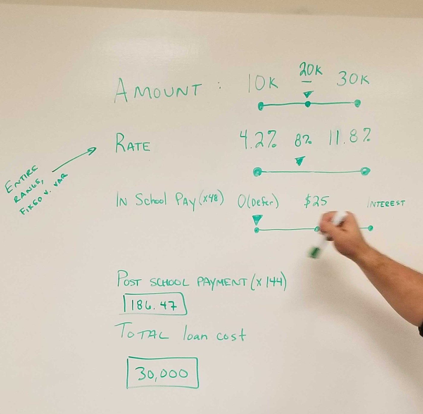
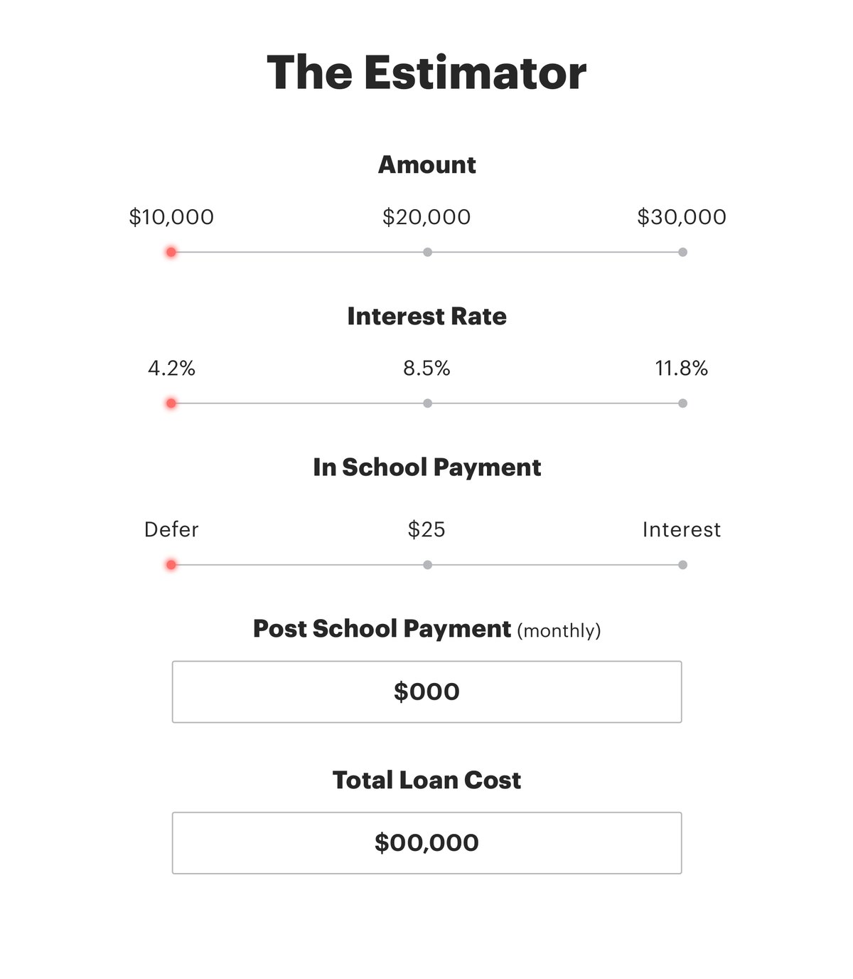
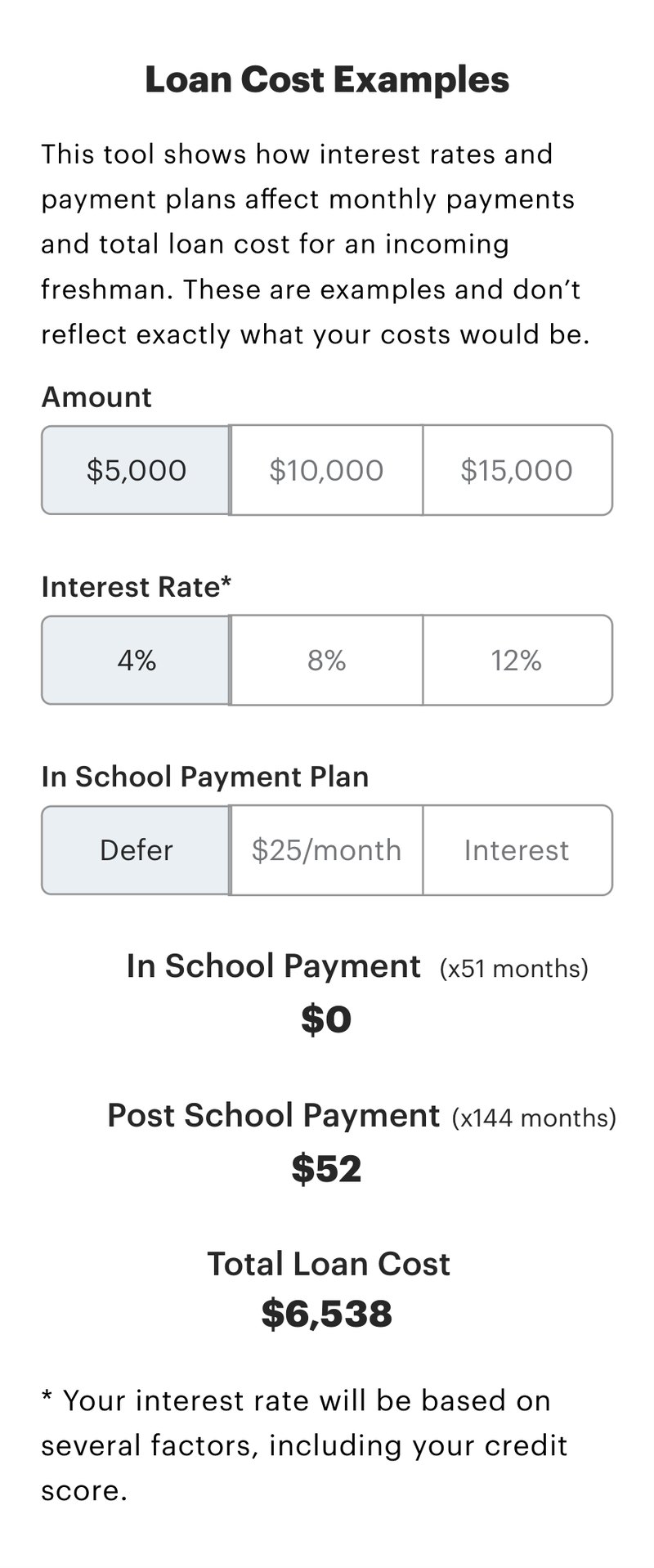
Six iterations, from a whiteboard to a shipping product
Every version below exists because something specific was learned — from a test, a stakeholder, or the brand rollout happening underneath us. The progression is short by design: each pass answers one question and gets back in front of people.
 Enlarge
 Enlarge
 Enlarge
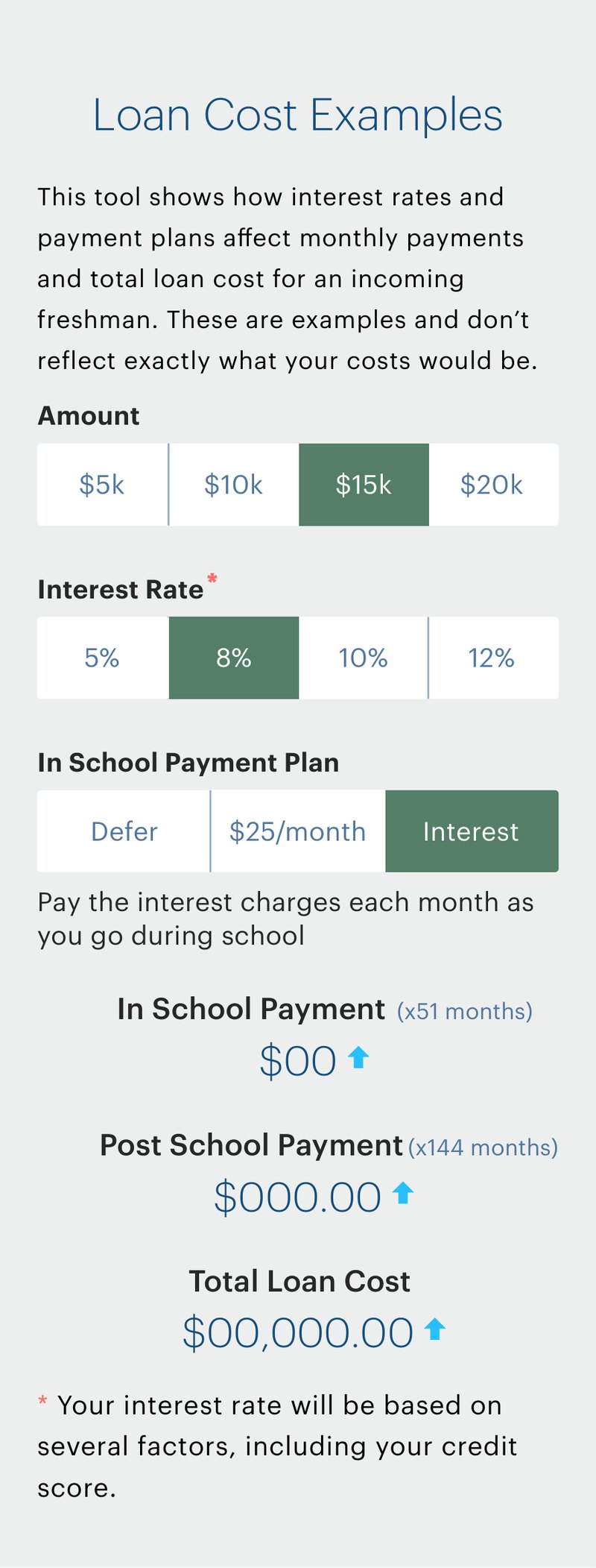 Enlarge
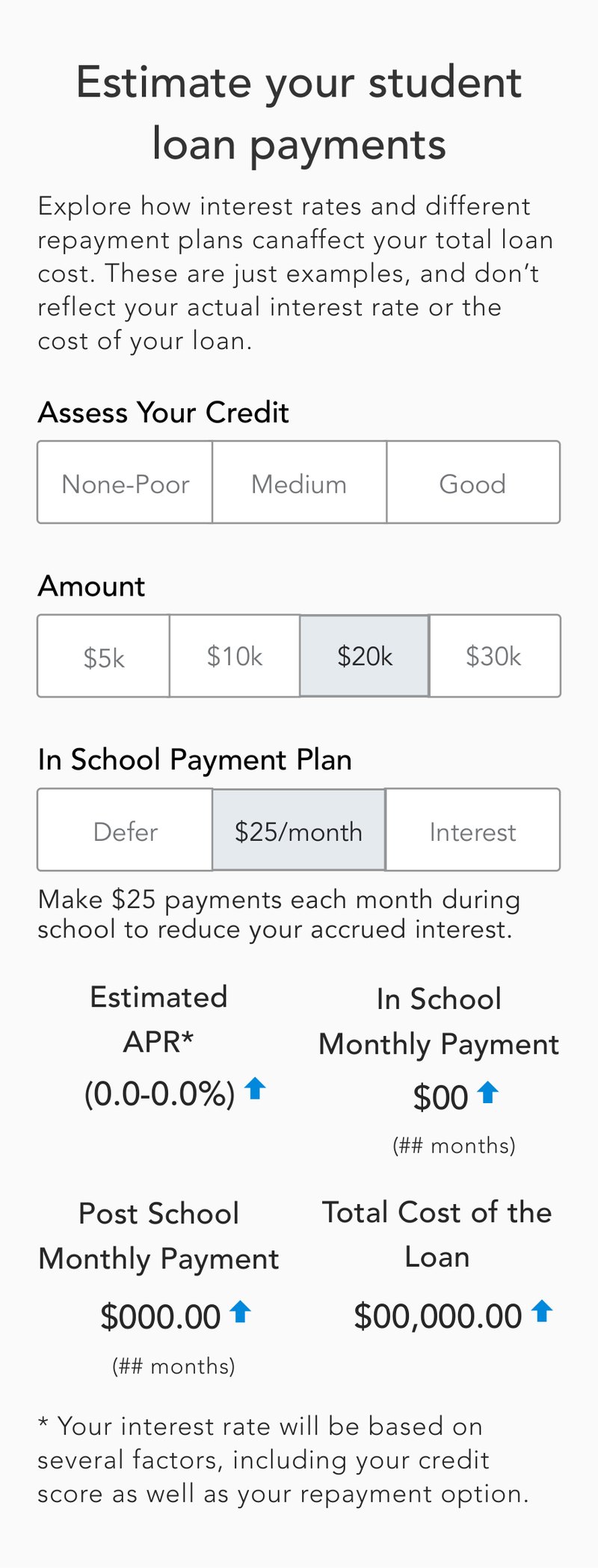 Enlarge
Iterations ran in both the legacy and incoming brand palettes — the company rebrand was rolling out underneath this project and the loan application redesign at the same time.
The shipped design
The final tool holds the two synthesis rules in one screen. It loads already answered — a real example with real numbers, no empty form — and everything on it is one tap from a different scenario. Amount, interest rate, and in-school payment plan are three rows of segmented controls; underneath them, the three numbers that matter update in place with an arrow marking the direction of the change.
Nothing is hidden behind a submit button, and nothing is presented as a promise: the total is framed as an example, the rate carries its disclaimer, and the right-hand column explains what each repayment choice does to the total in plain language — deferred payments cost more, $25 a month costs less, interest-only costs least. That column is the “how can I reduce this?” question from the lab, answered on the page.
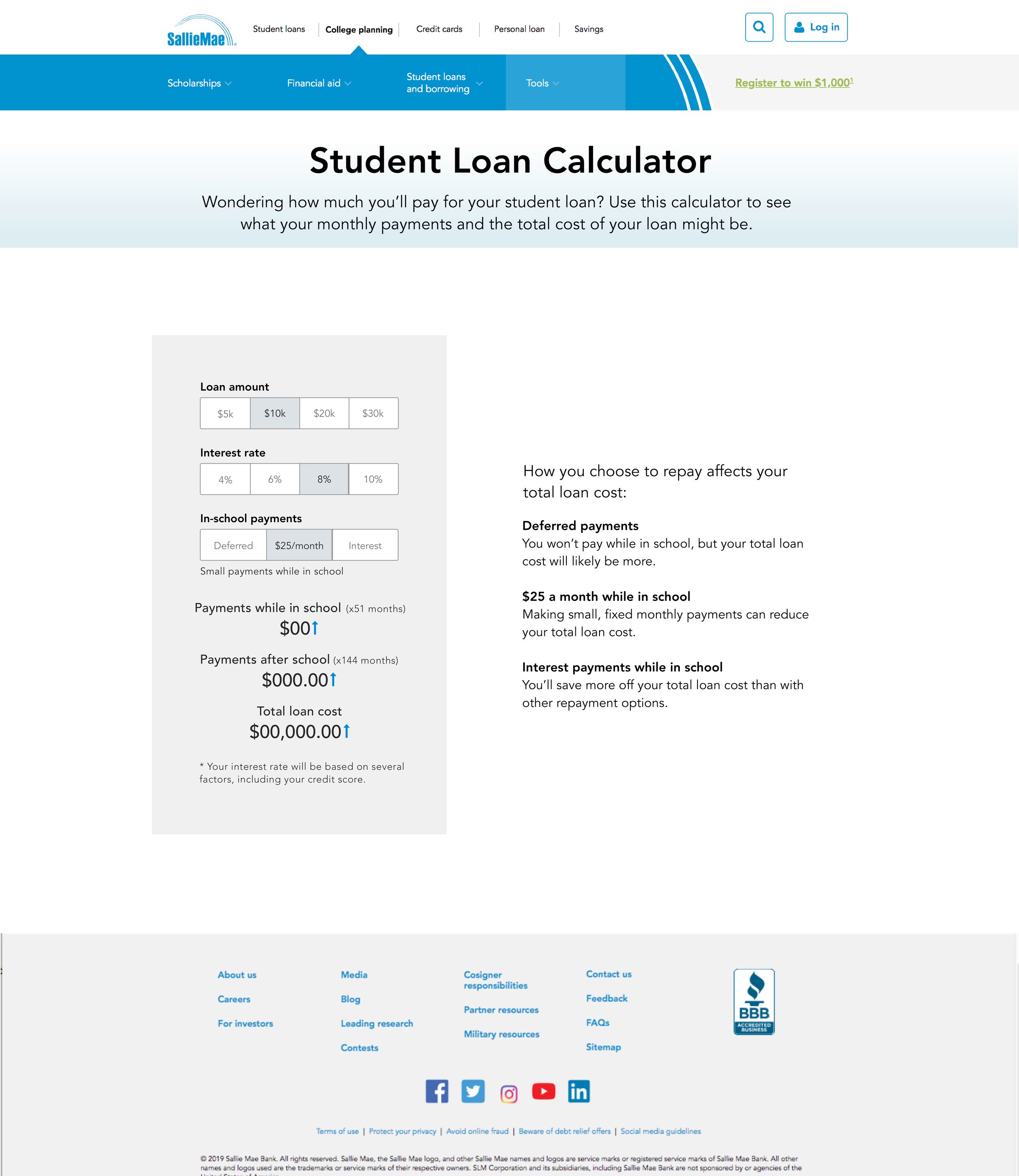 Open full size
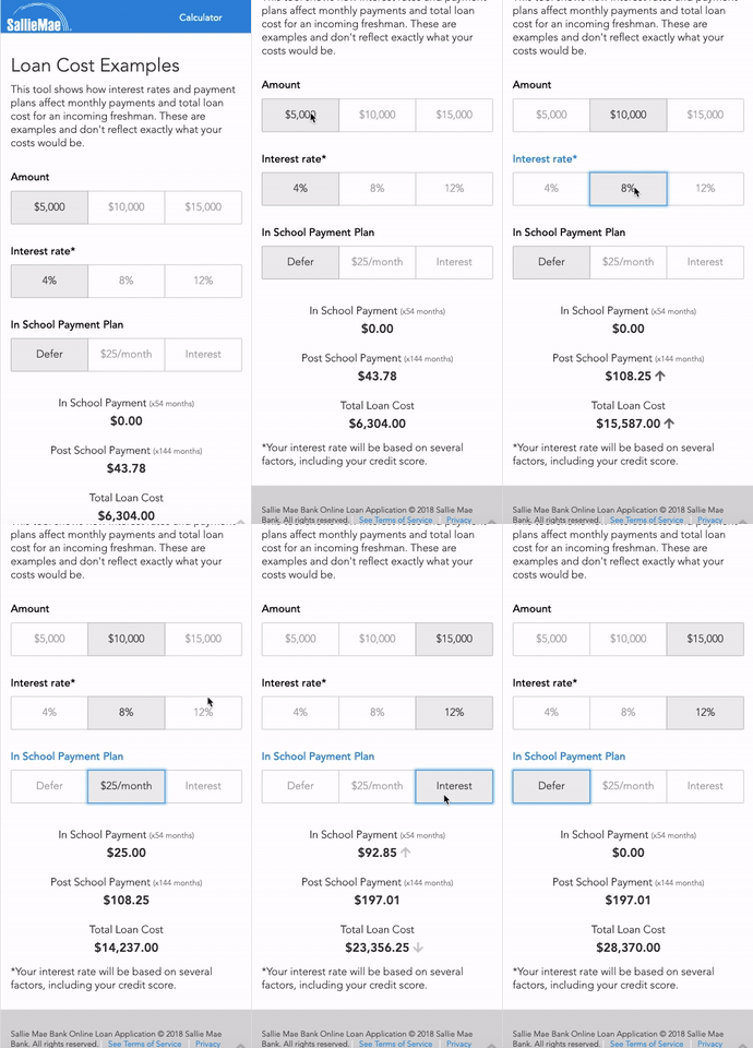
 Enlarge
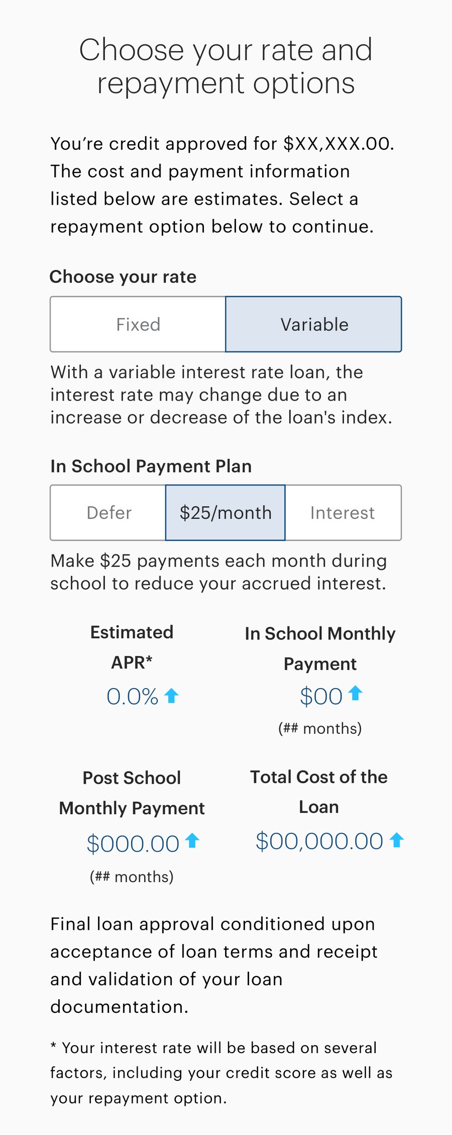
That last screen is the part I'm most pleased with. The same interaction model — choose an option, see the total move, read what the choice means — graduated out of a marketing-page calculator and into the application itself, at the moment a real approved borrower chooses fixed versus variable and picks a repayment plan. The estimator stopped being a feature and became a pattern the product could reuse.
What shipped, and what it changed
- An estimator that ships the research: an interactive example, live totals, and a plain-language explanation of every lever that moves the cost
- Lean UX proved out as a repeatable process for the org — a canvas the whole team could fill in, a riskiest assumption named out loud, and a solution validated with real users before a line of production code was written
- The Lean UX Canvas introduced to our project manager, product manager, and stakeholders, and iterated with them until it carried their assumptions as well as ours
- Legal's and Sales' objections answered with lab evidence rather than argument — and a credit self-assessment that gives customers a usable estimate without a hard pull
- The interaction model carried forward into the loan application's rate and repayment step