Service Agreements
The recurring-revenue contract at the center of every service business — adopted from a partner's software, rebuilt around the relationship it actually describes, and shipped as the form and table pattern the rest of the product now follows.
I was the only designer on this feature from the first customer interview to the UI review of what shipped. There was no researcher, no design lead, and no existing pattern library to inherit — the process was mine to define as well as run.
- Discovery & research
- Customer interviews, internal interviews across sales, CS, and support, competitive analysis of the partner system and its alternatives, affinity mapping
- Definition & buy-in
- Problem statements, the must-have / nice-to-have split, and the proposal I presented to the C-suite and directors
- Design
- Low-fidelity iteration through high-fidelity mockups and clickable prototypes in Figma, across six screens and two record types
- Validation & delivery
- Usability testing, customer and prospect demos, specification and documentation for engineering, and UI review of the built product
Plumbing, HVAC, roofing, and landscaping companies live on service agreements — the recurring contracts that schedule the work, retain the customer, and carry the labor, costs, and maintenance calendar for a year at a time. Operix had no way to create or manage one.
In spring of 2021 I was asked to design the feature. It started as a supplement to our partnership with Sage, whose service management product already had Agreements functionality of its own. That framing changed fast. As Operix moved toward availability through Intacct and QuickBooks Online, it became clear that most of the prospects evaluating us treated Agreements as a must-have — the thing that justified the whole implementation. The roadmap shifted to prioritize the project, and the definition of MVP moved with it.
As a service provider, our user needs to manage contract agreements with their customers — tracking performance, costs, labor hours, work performed, and maintenance schedules.
Before: creating an agreement in the partner system
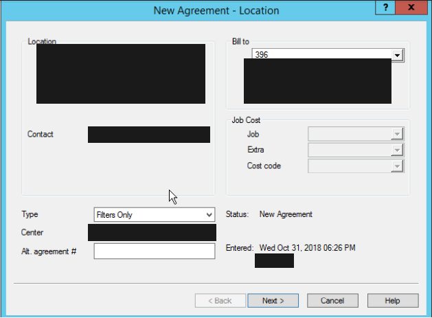
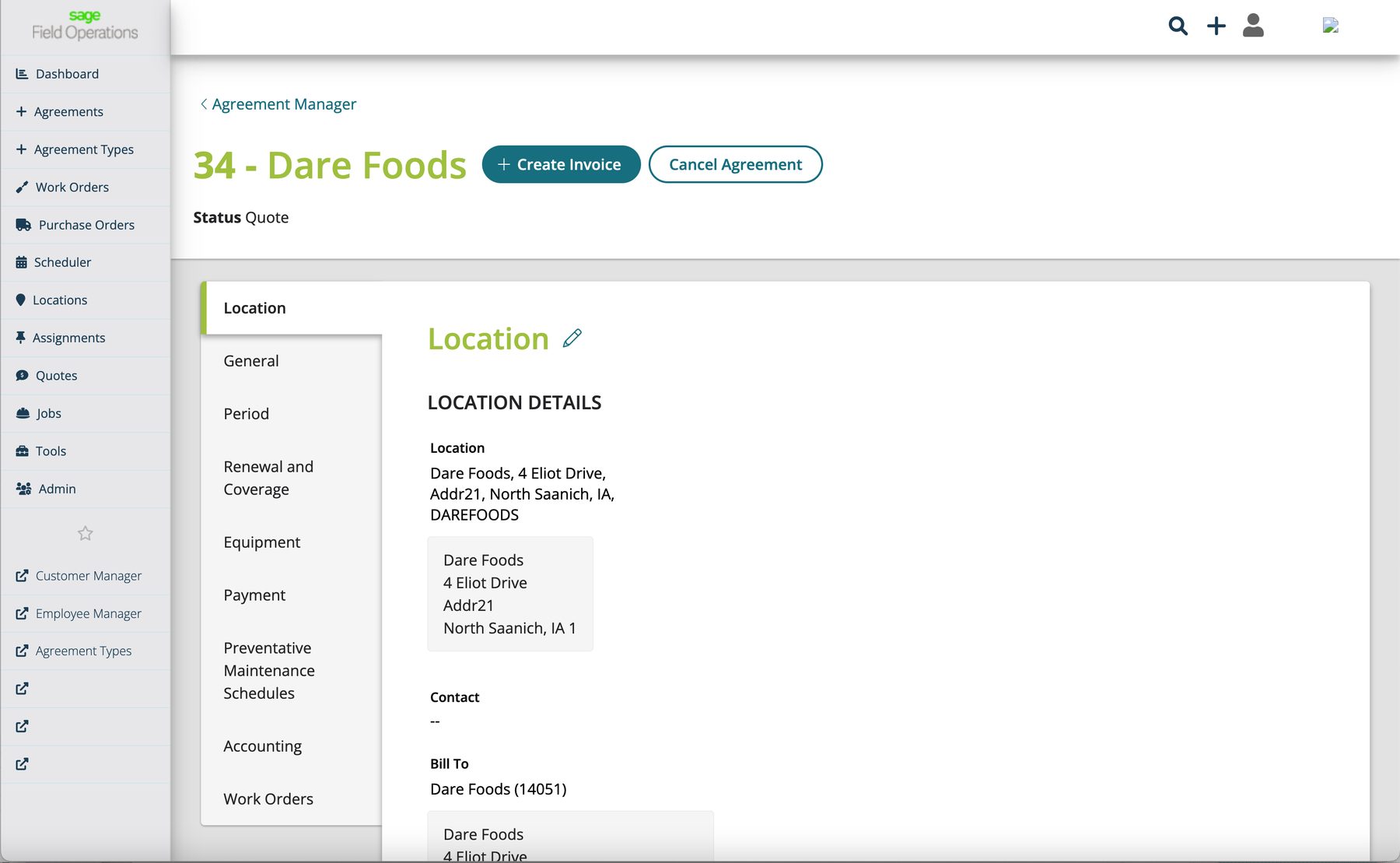
The experience customers had today was a multi-step modal wizard inside Sage Service Management — a stack of dialogs that collected the location, the labor, the equipment, the schedule, and the contract terms as separate, manually linked steps.
 Enlarge
Learning the process before touching the screens
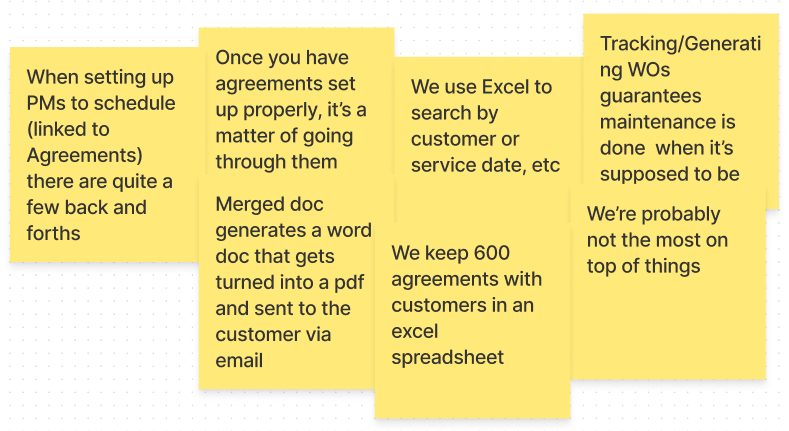
I started by learning the existing Sage workflow well enough to run it myself, then went to the people using it. I interviewed customers about their actual business practices — how they sold agreements, how they scheduled against them, where the software helped and where it got in the way — and talked to our own sales, customer success, and support teams for the perspectives customers don't volunteer on a call. Alongside that I ran a competitive analysis: the partner system we were supplementing, and the products prospects were weighing us against while they decided whether Agreements justified the implementation.
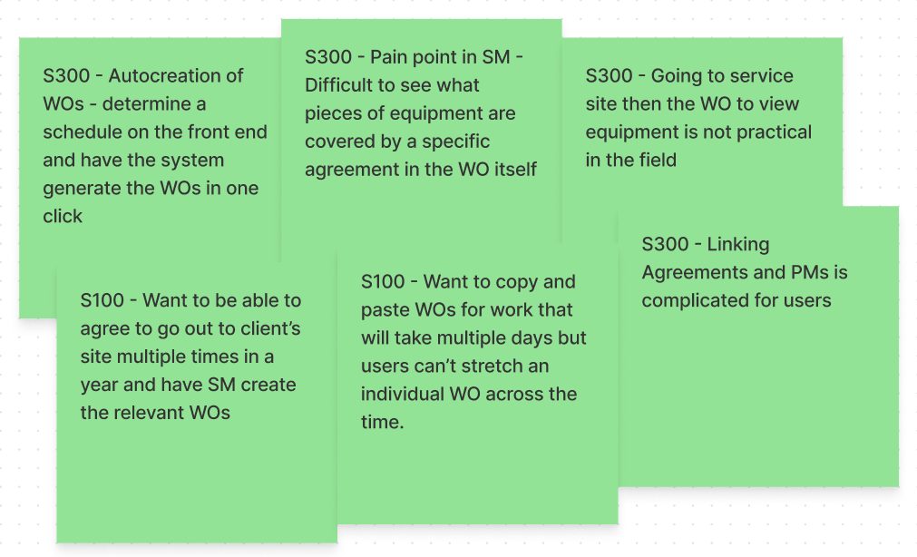
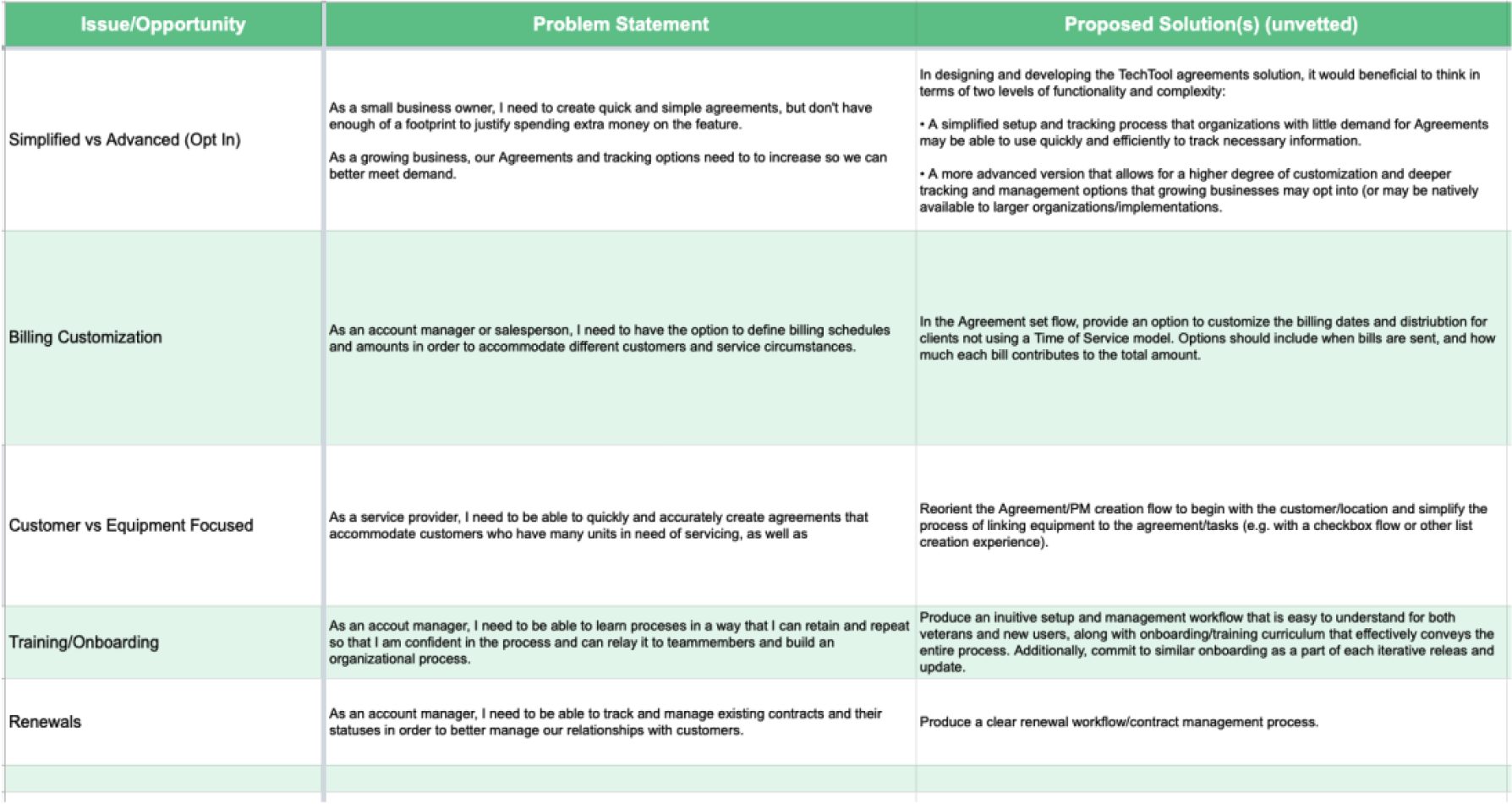
Affinity mapping turned those conversations into themes, and the themes into a working sheet of problem statements paired with proposed (and explicitly unvetted) solutions — the artifact I'd later build the leadership proposal from.
 Enlarge
 Enlarge
 Enlarge
The major pain point: an agreement with no center
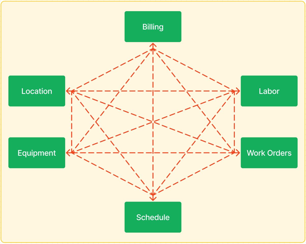
The biggest offender in every interview was structural. In the existing system an agreement had no central record holding it together. Location, labor, equipment, billing, schedules, and the resulting work orders each had to be manually linked to each other. Edit one — assuming an edit was even possible — and you had to go make the same change everywhere else by hand.
 Enlarge
Two structural moves
01 — Give the agreement a home
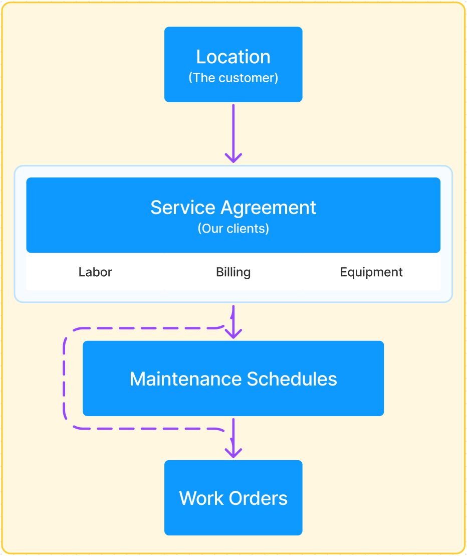
I proposed re-establishing the agreement as what it is in the real world: a relationship between the service provider and their customer. That gives the feature an obvious place to live — somewhere to find the record, edit it, and report on how it's performing — and it makes creation dramatically simpler. Once the relationship is the spine, a single form can walk someone through what used to be a multi-record linking exercise.
 Enlarge
02 — Multiple maintenance schedules under one agreement
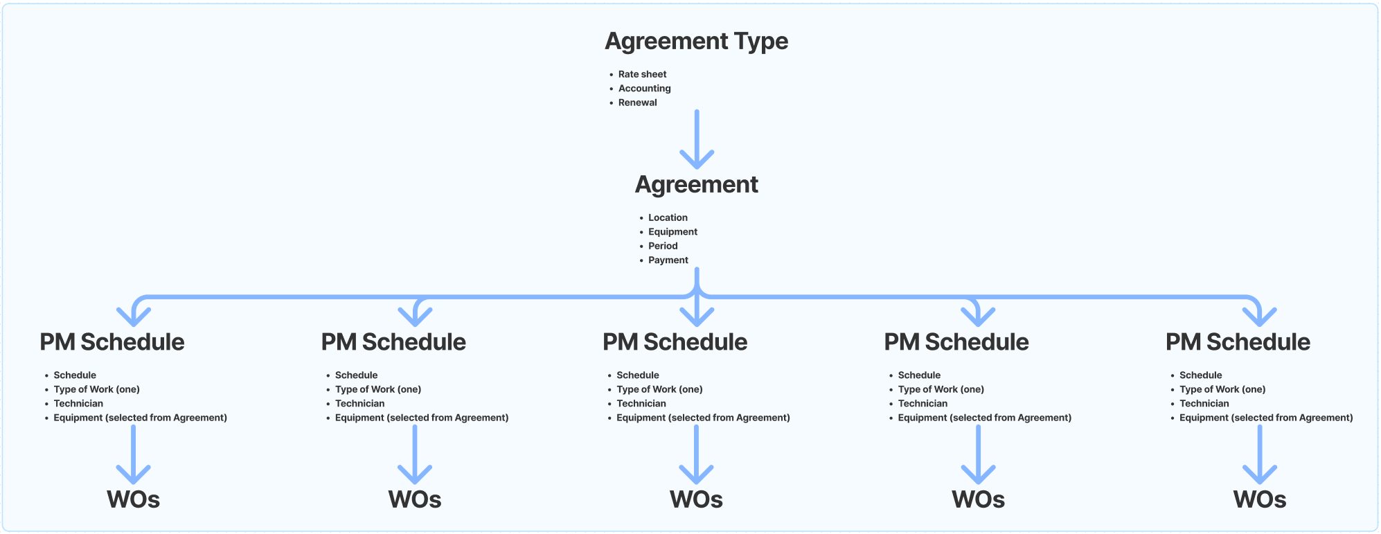
The second move answered a specific inefficiency: the partner system required a separate agreement for each flavor of work a customer's contract covered. A landscaping company with one client on spring cleanup, summer mowing, and fall wrap-up was running three agreements for one relationship — three records to renew, three to invoice against, three to reconcile.
Letting a single agreement carry multiple preventative maintenance schedules collapses that back down to one record, which is both easier to manage and a more honest reflection of how the business actually works.
 Enlarge
Selling it to the C-suite, and selling design along with it
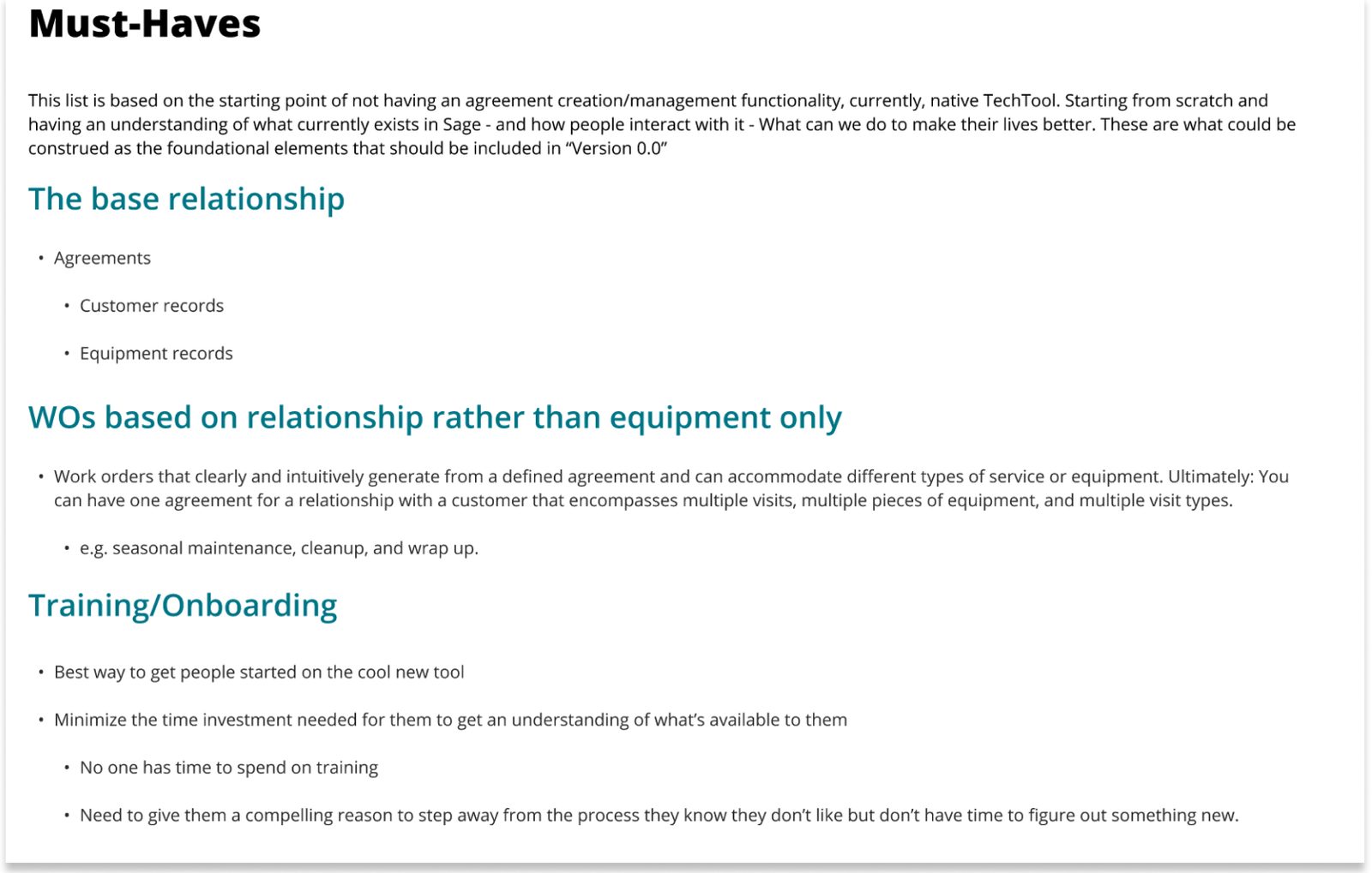
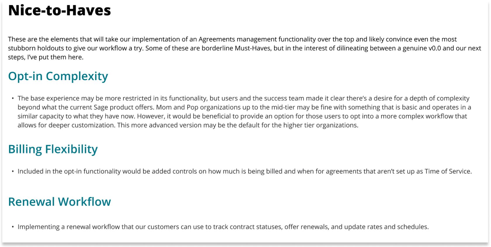
I packaged the process and findings into a presentation for business leadership — C-suite and directors — ending in recommendations split into must-haves and nice-to-haves the team could point and prioritize against for MVP and future releases.
Operix had never had a full-time product designer before me, so this presentation was doing two jobs at once. The second was evangelism: making the case that user experience outcomes belong in roadmap conversations alongside revenue and engineering capacity. Leadership was enthusiastic about the direction, and I moved ahead into design.
Three page types, one feature
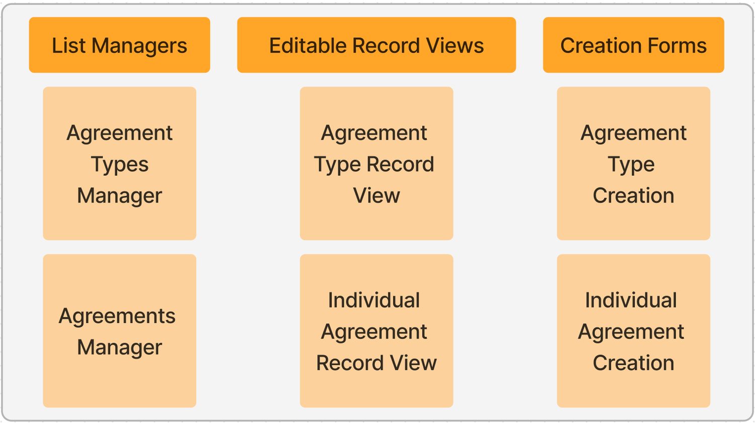
With the project approved, I broke the work down into the screens and workflows it would need. Everything resolved into three page types, each appearing twice — once for the Agreement Type (the reusable template carrying rate sheets, accounting, and renewal terms) and once for the individual agreement.
 Enlarge
Building the plane in flight
A constraint worth naming, because it shaped every screen that follows: there was no design system to build on. The UI that pre-dated our arrival in 2020 was inconsistent and dated, and the design team was two people — me, the company's first product designer, and a UI designer in her first extended role out of graphic design and typesetting.
So we constructed a “V2” system alongside our respective projects while also evangelizing design thinking to the rest of the organization. That meant real compromises in look and feel in favor of getting development-ready deliverables to good-enough-for-now — a trade I'd make again, and one worth being honest about.
 Enlarge
 Enlarge
List managers
The list managers were the most constrained surface in the project — heavily shaped by the existing API architecture built around the Sage partnership, which left limited room to move. What I could do was set precedent. I introduced a standardized actions column, simplified filtering, and established product and business conventions for page-level actions: Create Agreement and Download Report given primacy on the manager, so users can consistently anticipate what's available to them and when.
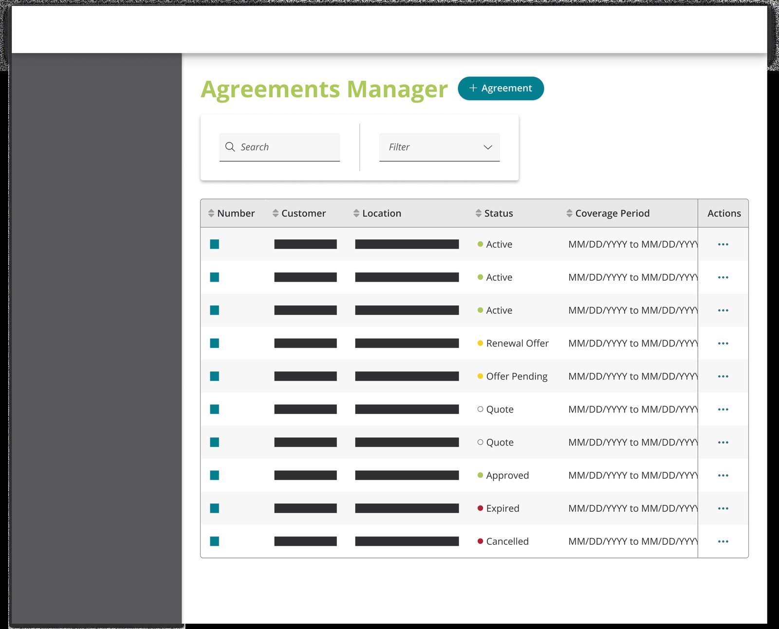 Enlarge
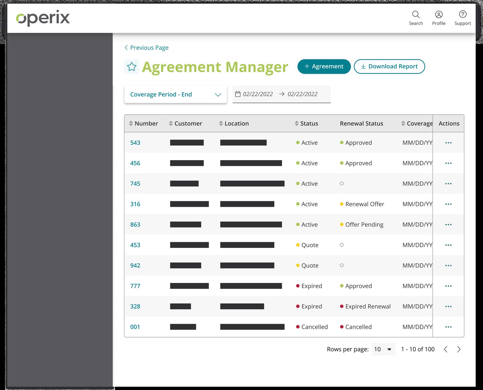 Enlarge
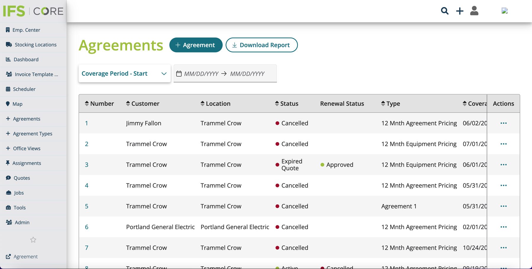 Enlarge
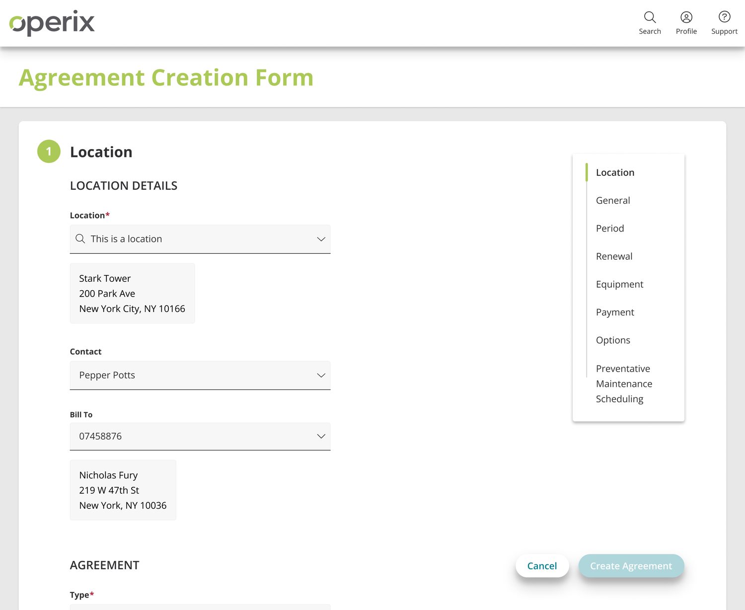
Creation forms — the biggest win
A multi-page, multi-record, redundantly actioned wizard became one page.
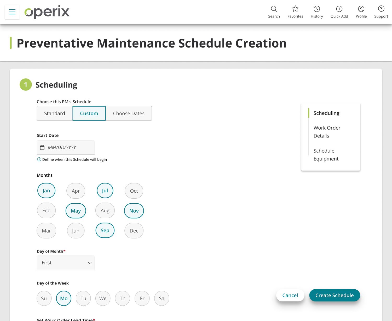
This was where the structural work paid off. Because the agreement now had a center, creation could be a single guided form rather than a chain of linked records. The design had to serve two opposite users at once: someone new to the software — or new to their company — who needs walking through, and the seasoned veteran who does this weekly and wants to move. A persistent section rail handles both: it orients the first user and gives the second a way to skip.
It's worth saying that a lot of these users create an agreement once a year. Designing for infrequent expertise is its own problem, and it's the reason the form explains itself as you go instead of assuming recall.
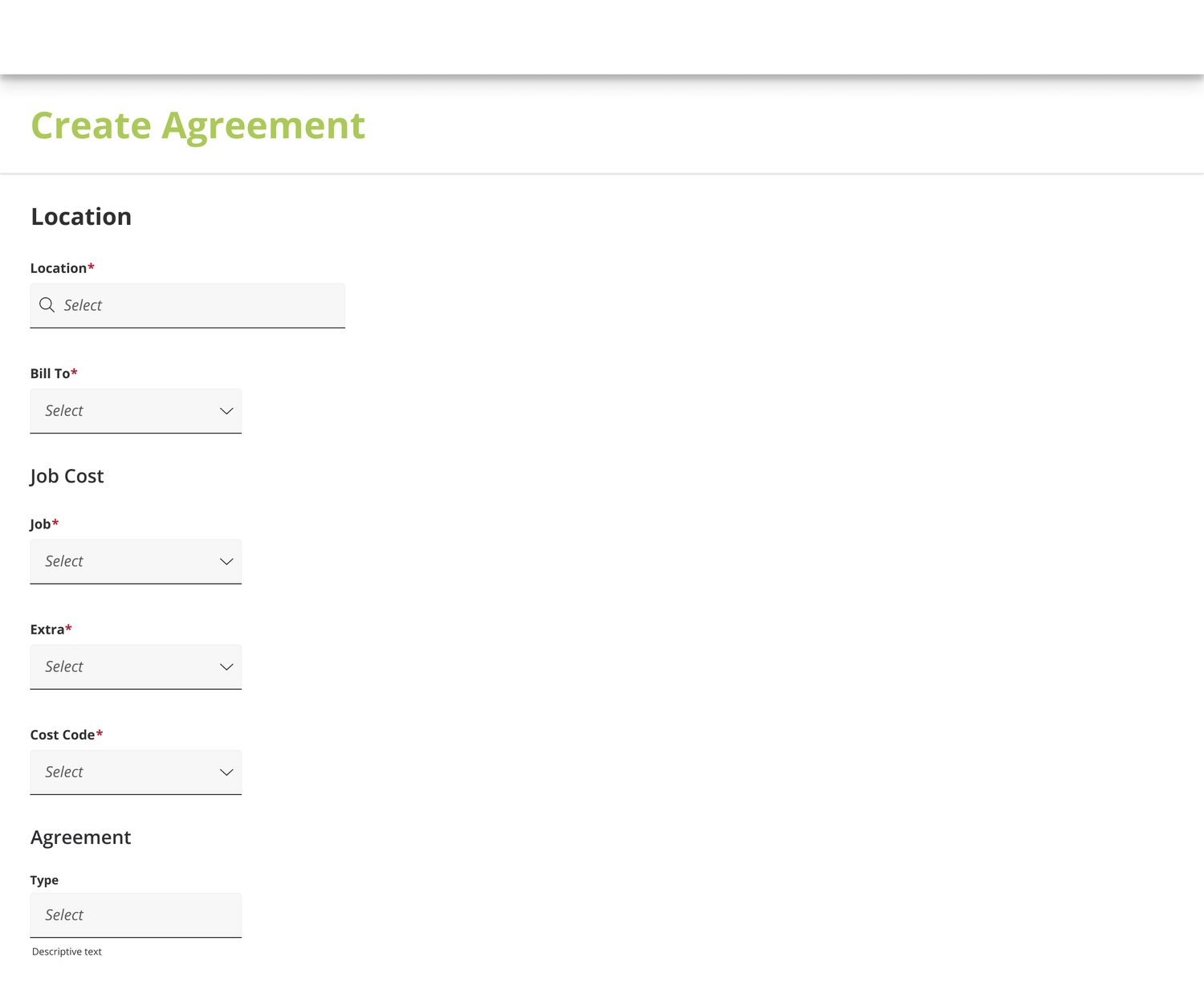 Enlarge
 Enlarge
Record views — a test bed for the rest of the product
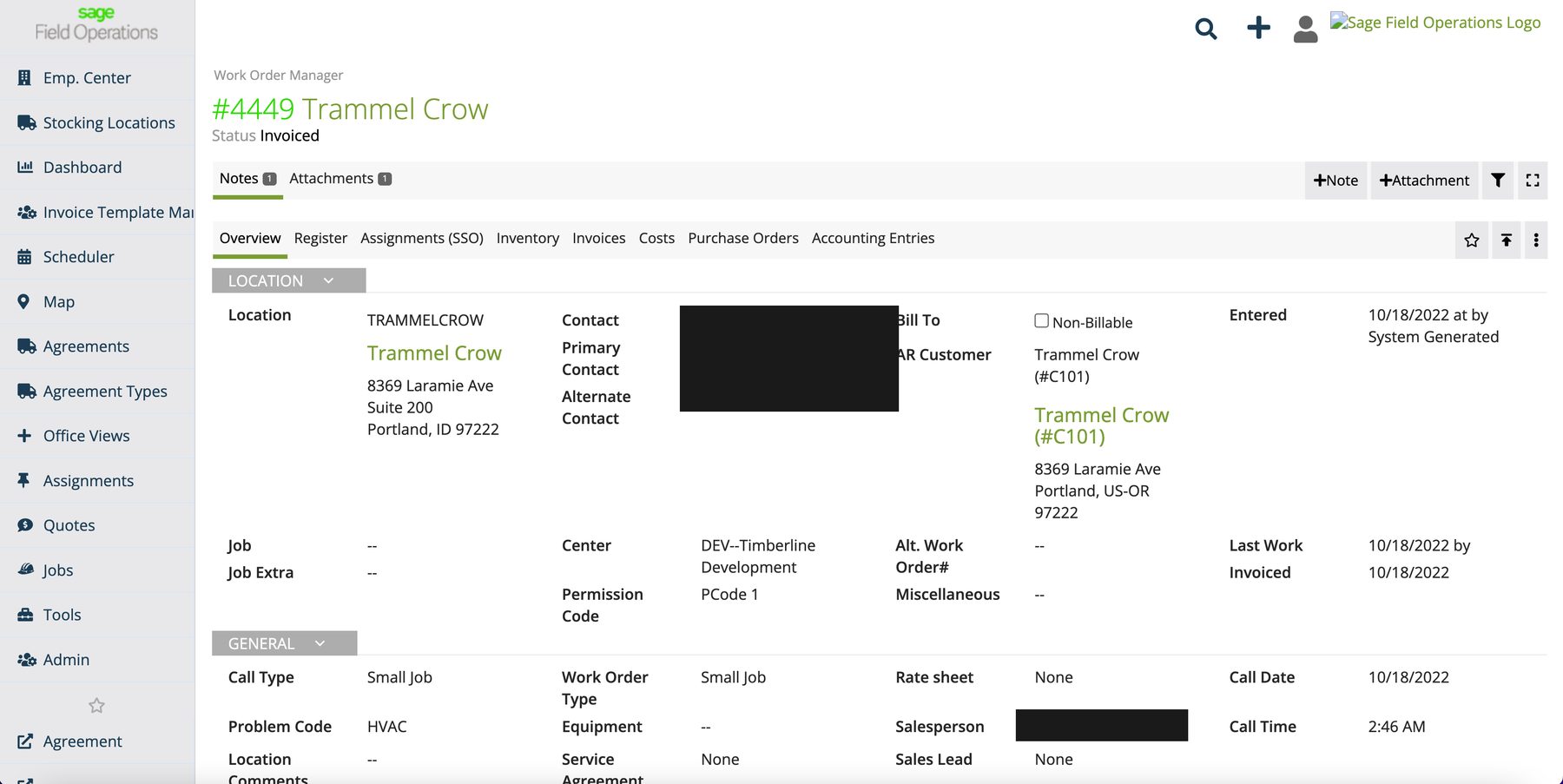
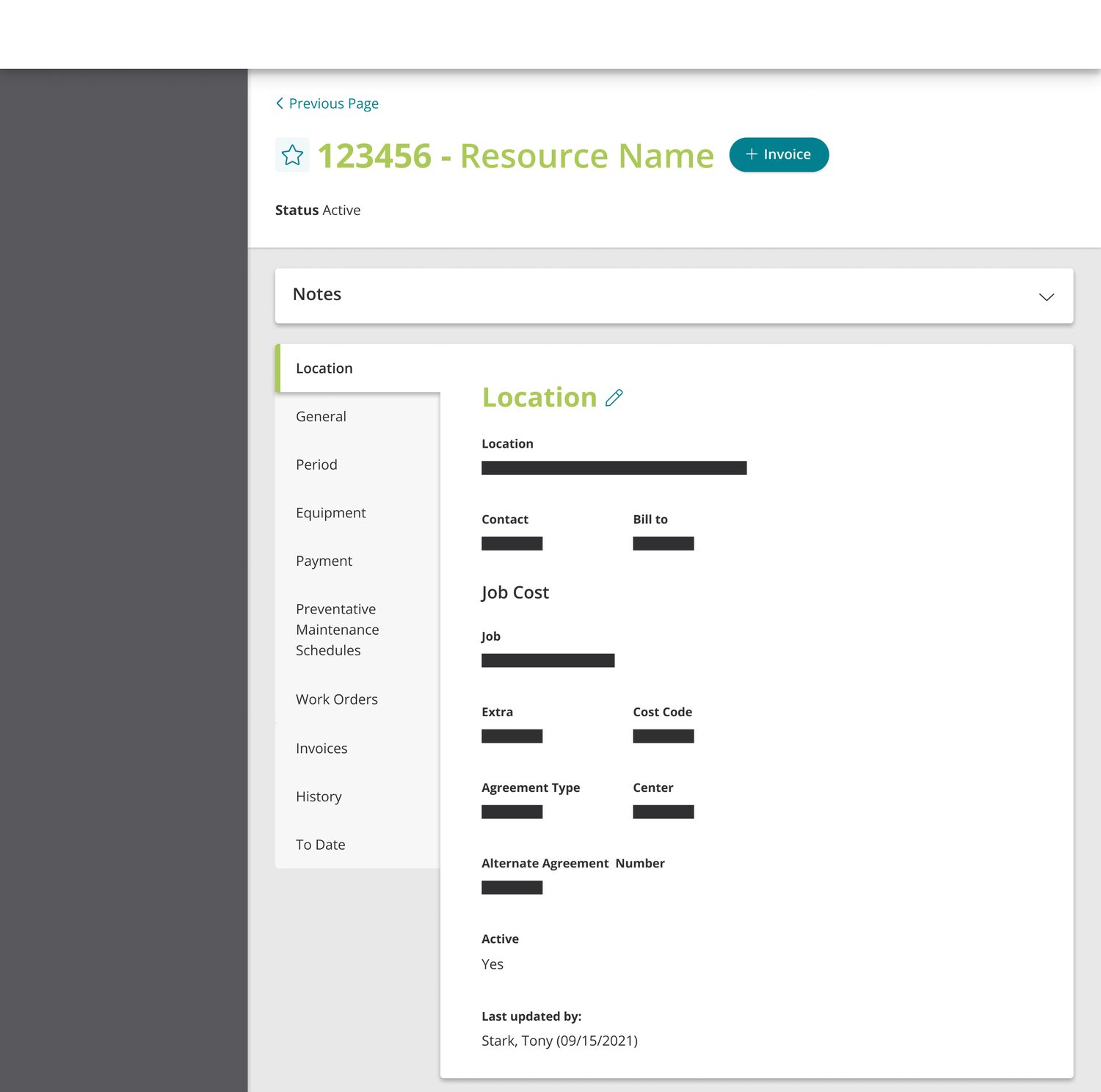
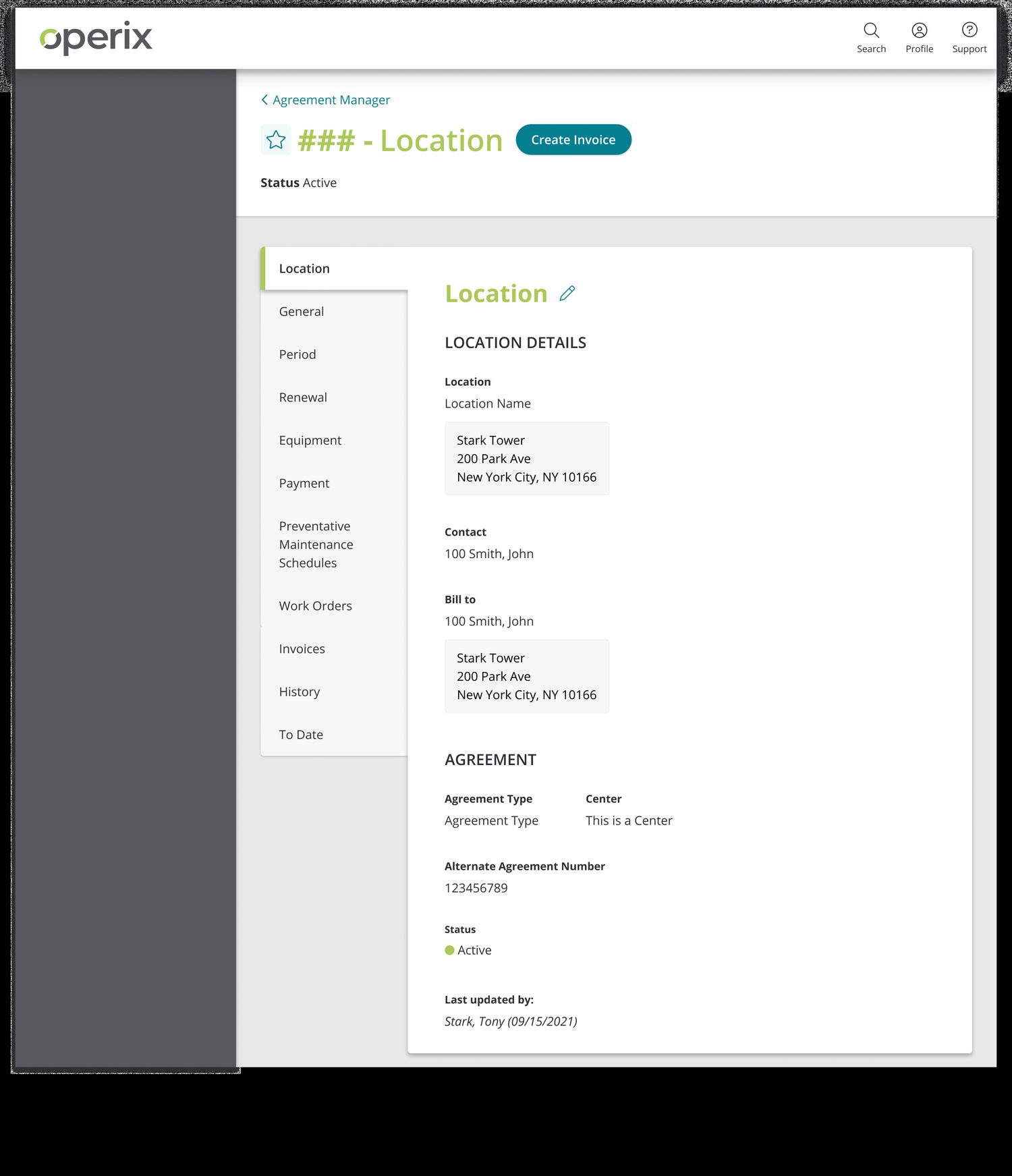
Record views make up most of Operix's screens. Users spend their days looking for and editing data in work orders, assignments, and job details, and stakeholders wanted that whole class of page improved. Agreements became the place to try things — new intra-record navigation patterns in particular, with a vertical section rail instead of the nested tab strips the product had been accumulating.
My own priority stayed narrower: make the record legible. If a field can be edited, the user should know without clicking around to find out. Important information should be findable fast, and adding detail shouldn't require leaving the page. Every section carries its own edit affordance, right next to the thing it edits.
 Enlarge
 Enlarge
 Enlarge
Putting it in front of the people who'd have to use it
The designs went out as clickable Figma prototypes rather than flat screens, which let me run usability tests with customers and demo the feature to the prospects whose buying decisions were driving the roadmap — often the same conversation. Being the only designer meant I scheduled the sessions, ran them, and folded what came back into the files myself.
Reception was consistently positive, and the creation form drew the strongest reaction — it was the change customers could feel immediately against the wizard they knew. That fed straight back into sales: multiple new-customer deals reportedly closed on the strength of the feature while it was still ahead of wide release.
I carried the work past design into delivery as well, writing the documentation engineering built against and reviewing the implemented UI against the files before release — the last of which is a step worth having, because it's where a design either survives implementation or quietly doesn't.
Late arrival: renewal offers
The MVP was already substantial from the jump, and I campaigned to hold the line against feature-itis in the interest of getting something real in front of customers. But business requirements moved. Renewals — explicitly filed as a v2 nice-to-have in my own proposal — became a must-have for MVP.
That brought a volume of new business rules and logic with it: new scenarios and edge cases, lifts on records and forms that were already settled, and reporting considerations nobody had scoped. Threading new functionality back through wiring you'd already resolved is an interesting problem, and an expensive one.
I'd argued against it and lost, which made the next decision the real one: whether to keep relitigating a call leadership had already made, or to go rework six screens well. The reason this was the right call from the business's side is the same reason the project existed at all — prospects were treating Agreements as the thing that justified their whole implementation, and an agreement you can't renew isn't a recurring-revenue product. Taking the rework meant working much more closely with the business analyst and the API engineers than the original scope had required, because the new rules were mostly theirs.
Nice-to-have → MVP requirement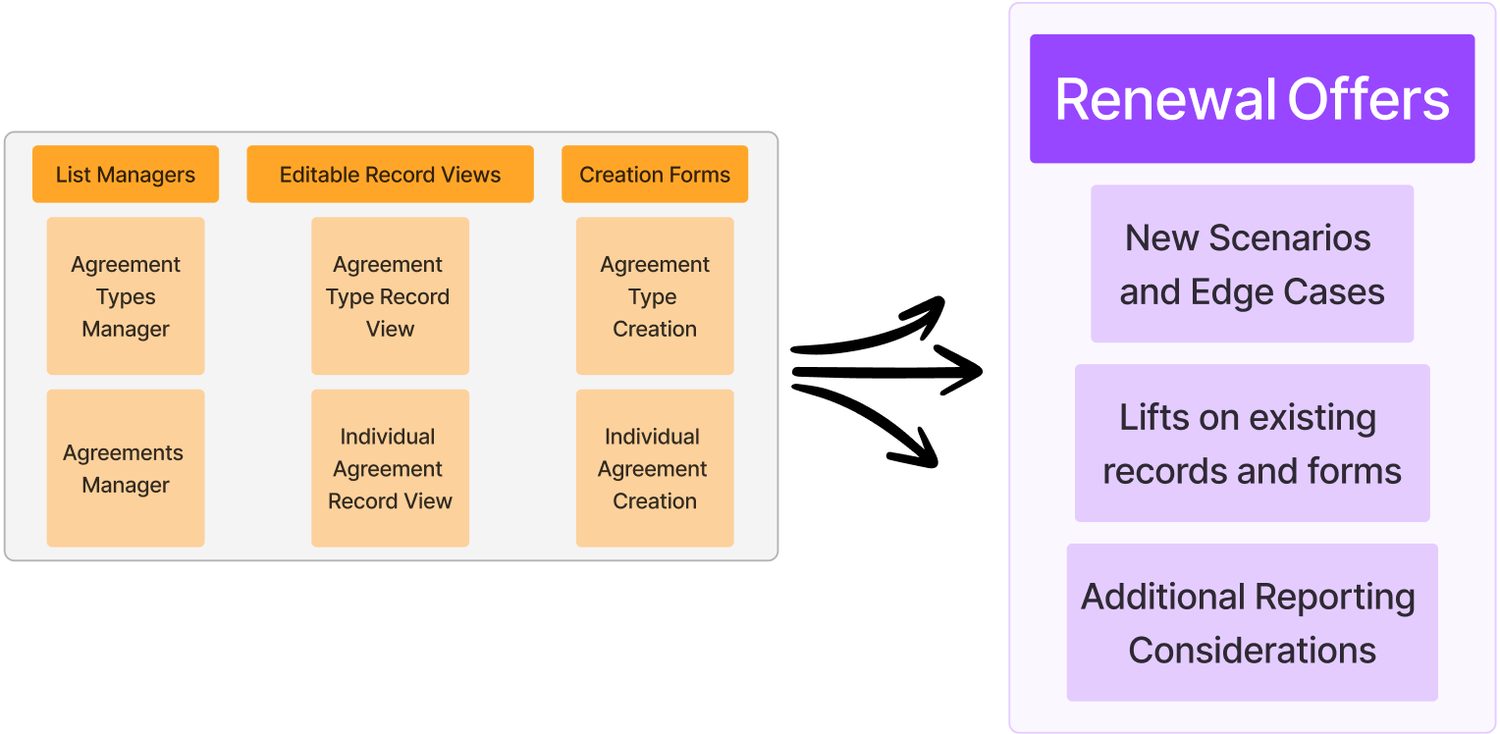 Enlarge
The renewal tab, then and now
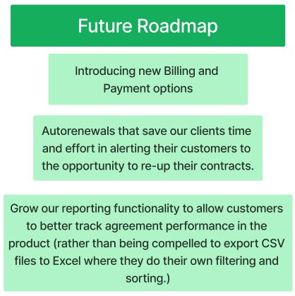
The original renewal tab was deliberately thin — a handful of settings inherited from the Agreement Type, overridable per agreement. The new requirements needed it to carry offer creation, tracking of outstanding offers, coverage periods, and historical performance reporting.
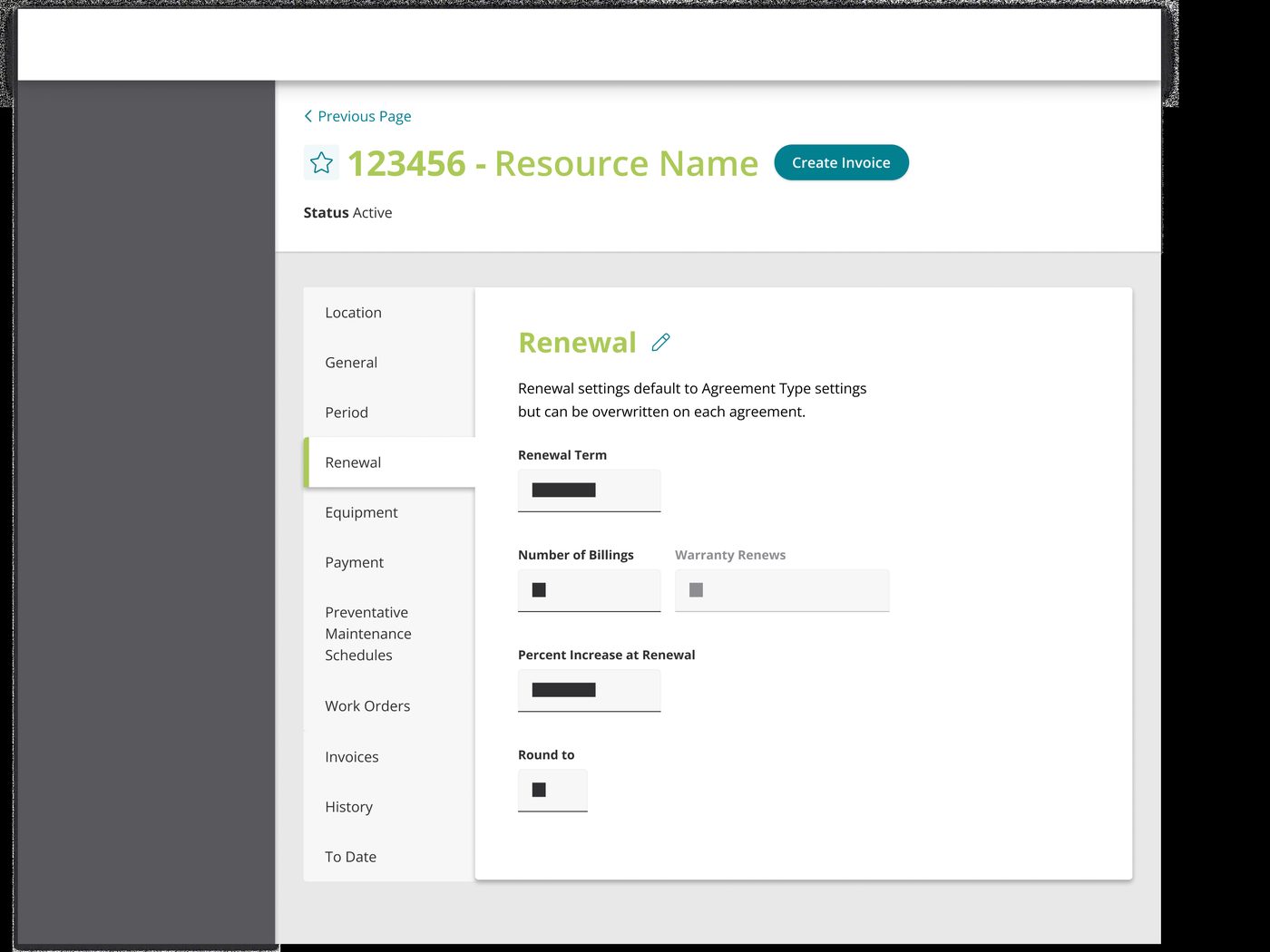 Enlarge
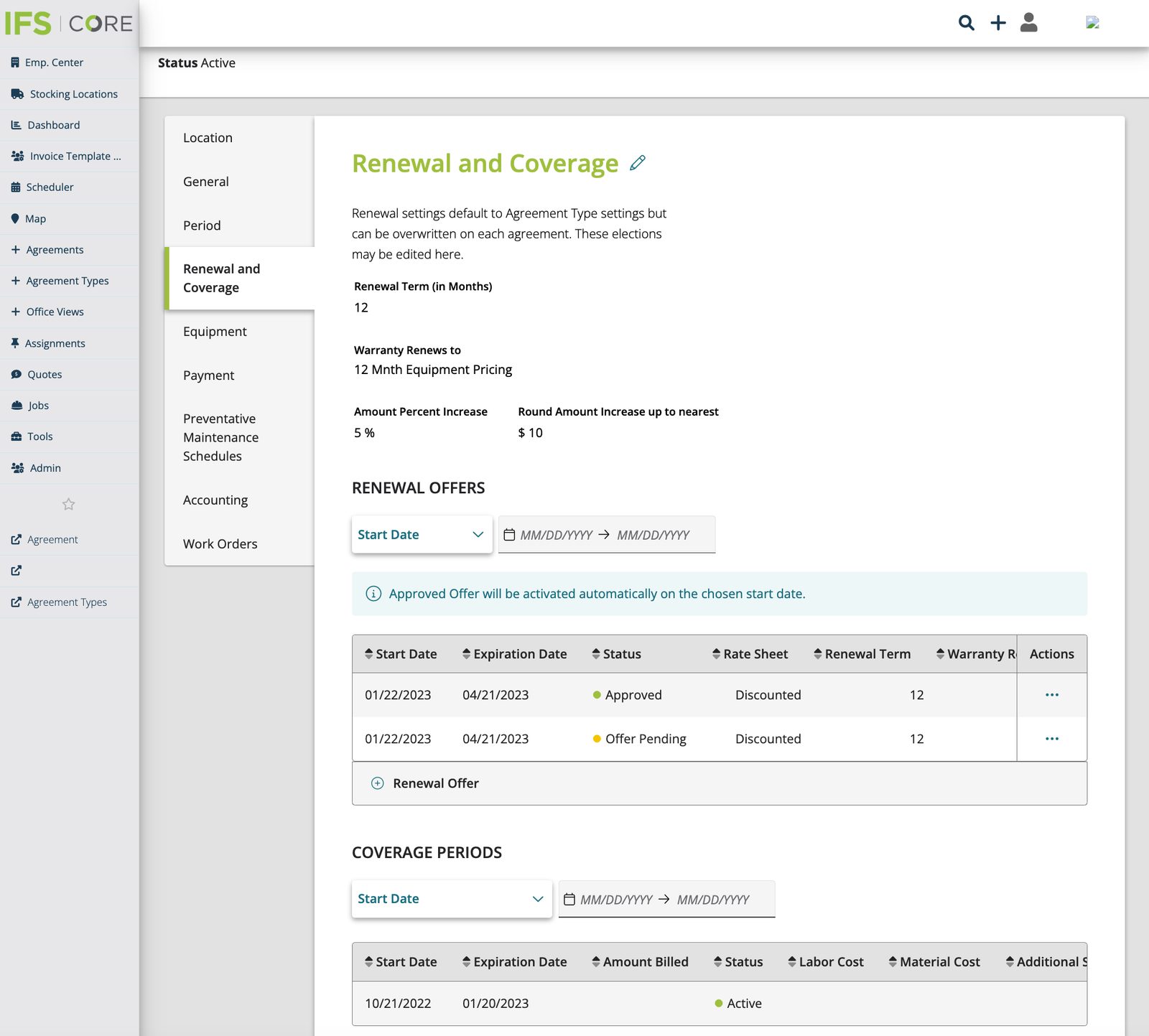 Enlarge
The team — me, my product owner, the director of product, our business analyst, and the front-end and API engineers — came out of it with a clear shared lesson, which was mostly about sequencing: business and engineering requirements need to enter the process much earlier than they did here, and documentation has to keep pace with them. That conclusion changed how I ran projects afterward.
Designing past the compromises
Even while making design-system compromises for MVP, I kept drawing the version the product should grow into, so there'd be somewhere to go when we could afford it. The “V3” screens capture that: moving off the company green in the headers, which we knew failed WCAG AA against white; retiring the fixed left menu stack for a space-saving hamburger; fully implementing the navigation shortcuts in the top right; and using color to make record status readable at a glance.
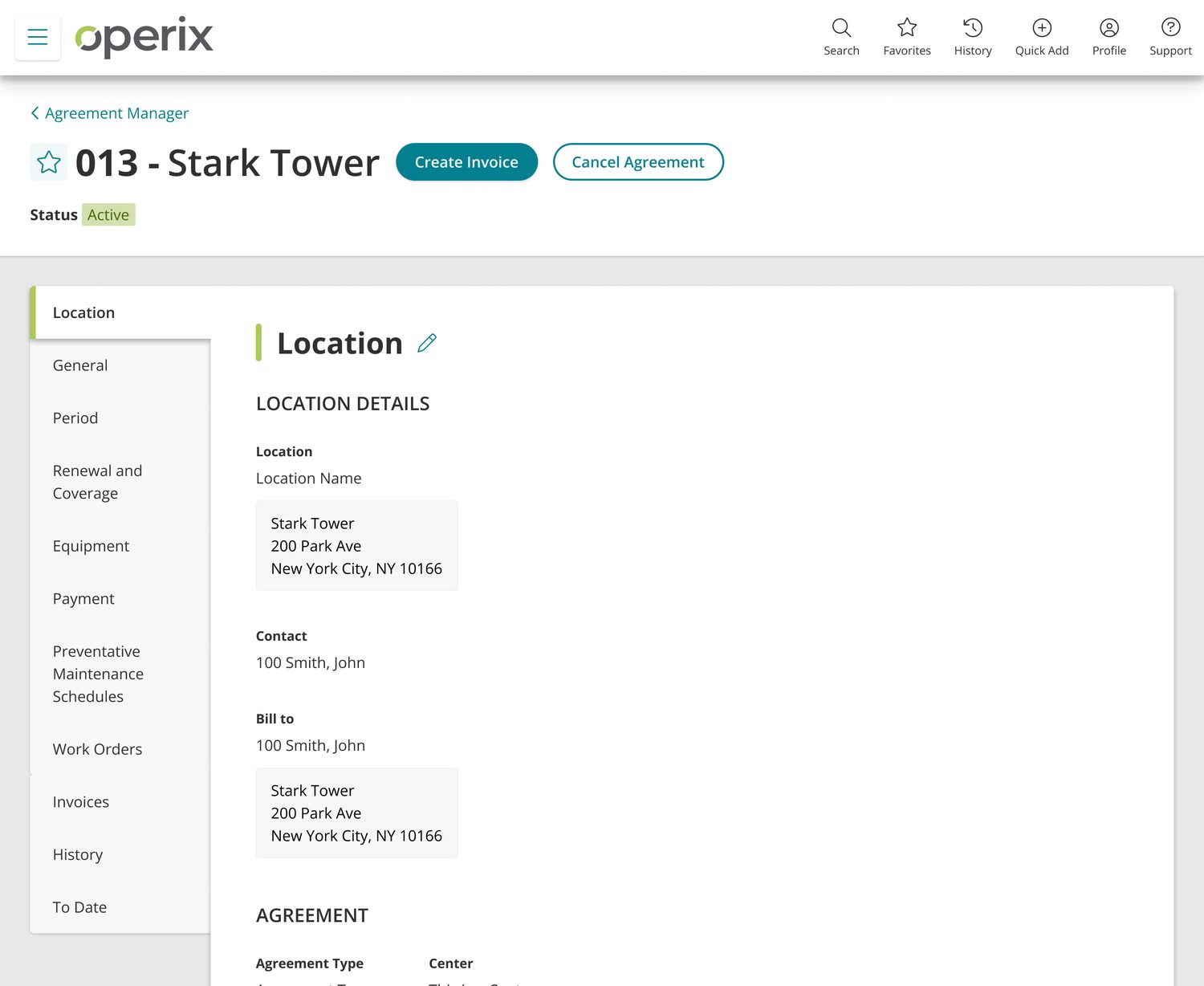 Enlarge
 Enlarge
 Enlarge
The pattern outlived the project
Agreements shipped in 2023 and is live with customers today. The more durable outcome is that it stopped being a feature and became a precedent.
The decisions made here under real constraint — the single guided creation form with a persistent section rail, the sectioned record view with edit affordances scoped to the section they belong to, the standardized actions column and page-level action hierarchy on list managers — became the reference implementation. Every new form and list manager in the product is built against them, and they're the style standard going into the in-progress product-wide overhaul. Alongside the work order record and dispatch map systems, this is one of three surfaces I designed that the rest of the product is now being rebuilt to match — a strange and satisfying result for a project that started as a supplement to somebody else's software.
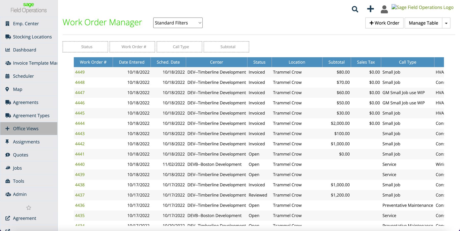
The clearest case: the Work Order Manager
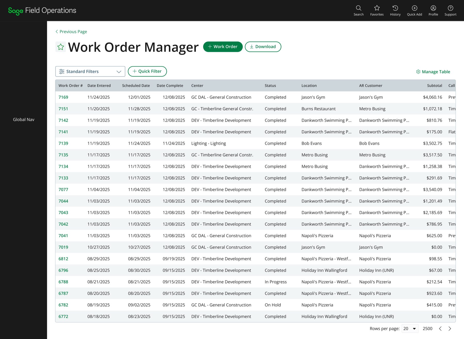
The work order is the most trafficked record in the product, and its list manager is the screen the office lives in. The version of it in the redesign proposal — approved, and on the roadmap alongside the work order record redesign — is built on the pattern I set here: the page title paired with a primary create action and a secondary download, filtering as a compact row above the table rather than a buried panel, sortable columns with the record ID as the link out, and status carried as its own column.
Some of the “V3” ideas from two sections up made the trip too — the header is off the company green, the navigation shortcuts sit in the top right, and the favoriting star rides next to the page title. Drawing the version you can't afford yet turns out to be worth the time.
Approved · on the redesign roadmap
Enlarge
 Enlarge
Approved and roadmapped, not yet released. Demo dataset throughout.
- Shipped in 2023 and live with customers today — list managers, creation forms, and record views for both agreement types and individual agreements
- Agreement creation went from a multi-page, multi-record wizard in the partner system to a single guided form
- The form and list manager patterns designed here became the product's standard — every new form and manager is built against them, and they're the baseline for the product-wide overhaul now underway
- The redesigned Work Order Manager, built on this pattern, was approved and added to the redesign roadmap alongside the work order record
- Multiple new-customer deals reportedly closed on the strength of the feature while it was still a prototype
- The proposal process established user experience outcomes as a standing input to roadmap decisions at a company that had never had a product designer
The honest counterweight: adoption has been slower than the reception predicted. At my last look at the analytics, roughly a quarter of customers had spent real time in the feature — an approximate read rather than a figure I can currently stand behind to the decimal. Most of that gap is execution rather than appetite: technical failures during build-out held up full rollout, including a bug that effectively broke the renewal workflows — the same renewals whose late arrival had already cost the team a round of rework. A design that tests well and ships broken is still a design that hasn't reached anyone yet.
Which makes the sequencing lesson from that retro — business and engineering requirements entering the process earlier, with documentation keeping pace — the part I carried forward most deliberately. It's also why I pushed Pendo and Maze into the organization afterward: I wanted the next project's adoption story to be something I could measure while there was still time to act on it, rather than estimate afterward.