Work Order Record Redesign
The record every technician's day runs through — rebuilt from two inconsistent views into one permission-driven system, with inline editing and a docked notes panel.
The work order is the most heavily trafficked record in the product — the thing that tracks work, costs, labor, time, materials, customer information, and site contacts for every job a specialty contractor runs. It also lived in two different places at once.
Two records for one job
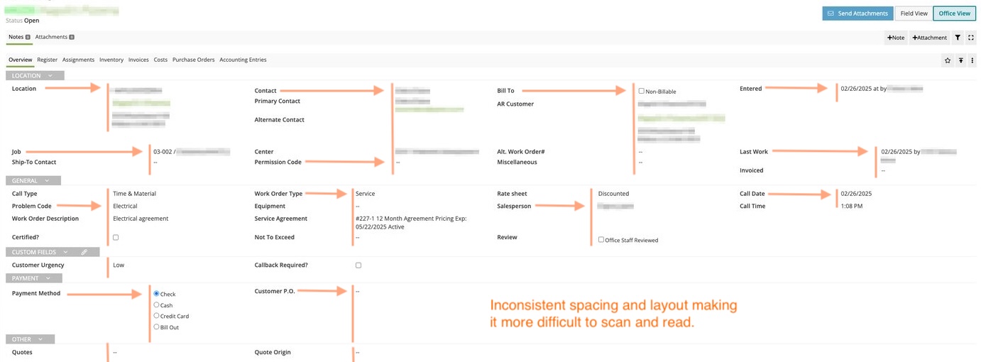
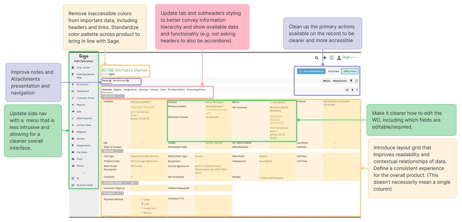
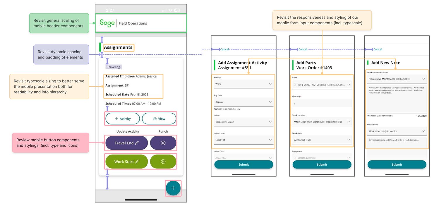
The record existed as two separate, inconsistent environments. Office View served admin roles — account managers, service managers, dispatchers. Field View served technicians in trucks, deliberately walled off from costs, pricing, and billing that the office needs but techs shouldn't see. Built at different times on different models, both had aged badly, neither was meaningfully responsive, and they shared the same core failures:
- Hard to tell what was editable
- Unclear feedback about what actually happened after a change
- No confirmation step — inadvertent edits were easy to make and hard to catch
- Users often didn't know what they were allowed to change in the first place
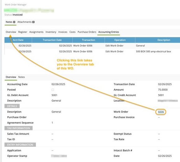
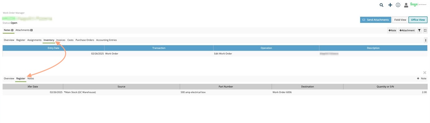
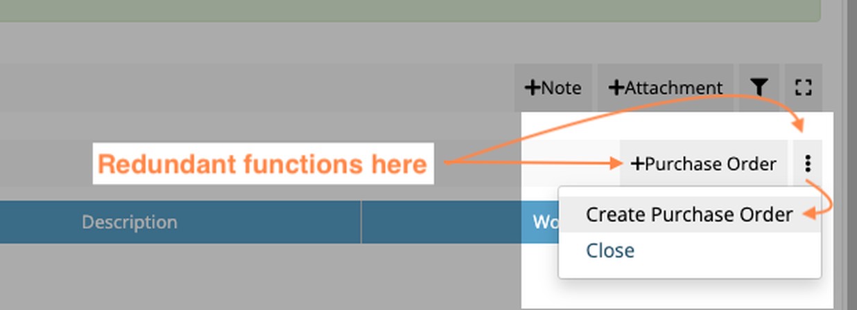
Users were constantly bouncing between the two views depending on what they needed, generating extra steps and support calls that shouldn't have existed.
 Enlarge
 Enlarge
 Enlarge
 Enlarge
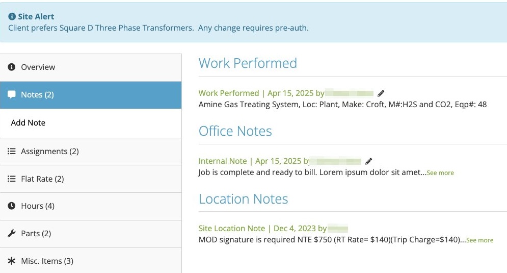 Enlarge
Customer data redacted throughout; UI and annotations left intact.
Why it got that way
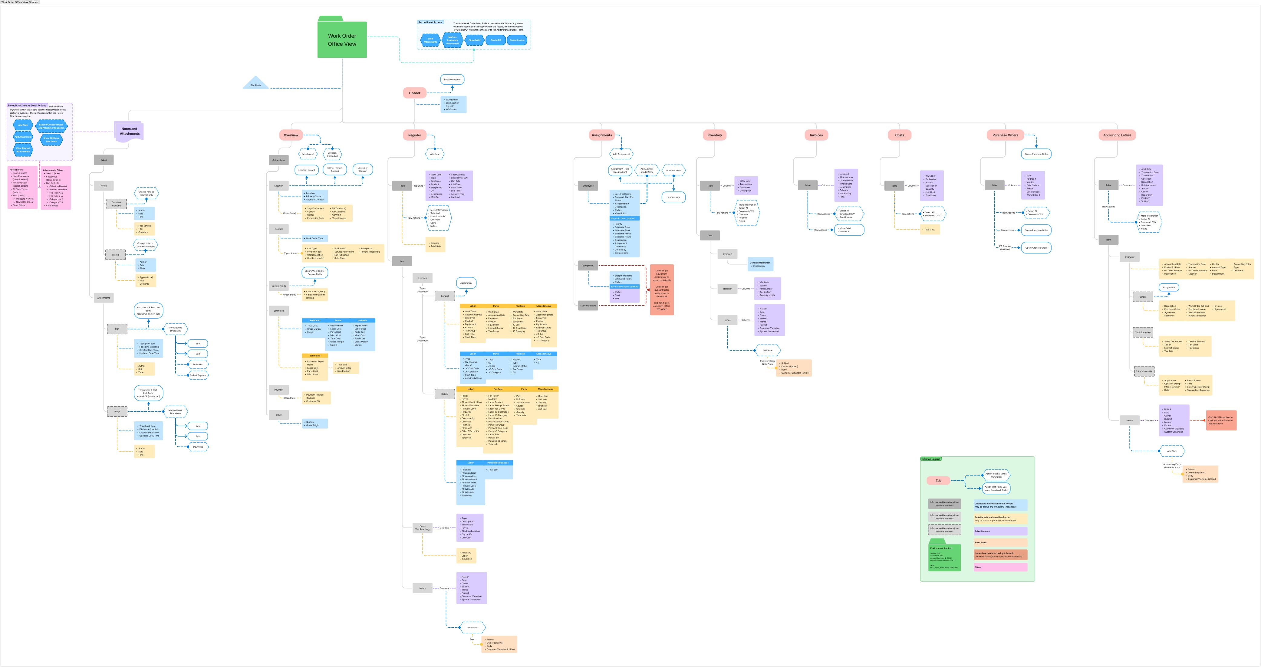
Both environments had been built almost entirely by engineers without front-end best practices — effectively all hardcoded, and deeply entangled with the accounting system underneath. No sitemap or documentation of the work order record existed anywhere in the company, for product or engineering. The wider product had grown the same way: features built reactively for whichever large client asked loudest, with no standardization holding them together.
 Open full size
Six years of listening, then a focused round
I joined Operix in early 2020 and encountered these shortcomings immediately. Fixing them became a running motivation underneath every other project I touched — the work order creation form, contract creation and management, PowerBI, batch invoicing, etc. Any time I had a customer on a call, I probed that angle. By the time focused work order research began, I had roughly five years of accumulated insight into what made a good work order, what slowed people down, and which workarounds users had unconsciously adopted that the product should have been handling for them.
The focused phase added interviews across every role type — office users and field techs, plus internal salespeople, implementation managers, and product staff who'd worked in the trades themselves. I built the first in-depth sitemap and index of the Office View record that had ever existed: every tab, field, state, workflow, and context. Then I audited Field View for what could be merged over, and ran a competitive analysis informed by customers who'd sat through competitor pitches or used those products directly.
What I proposed
In 2024 the CEO asked me for a low-hanging-fruit list for Office View. I came back with a proposal to introduce standard components and a real layout grid — and that opened the appetite for something much larger. The full proposal came down to five moves:
-
01
Merge Office View and Field View into one record. One entity to onboard, implement, train, and maintain. Shared styling and workflows also mean office staff and techs can actually talk to each other about what they're looking at.
-
02
Make it fully responsive. The same record, usable in the office, in a van, or standing on site.
-
03
Introduce a modular, panel-based workflow system. A predictable set of panels on any record page, so users can anticipate what they're looking at and how to work it before they've finished reading the screen.
-
04
Reorganize the layout. Notes and attachments stop dominating the real estate for people who don't need them constantly — while staying available, because they're central to how users read and edit records.
-
05
Renovate the register and table elements. The register ran on a third-party table plugin that took too many clicks and confused people — a serious time sink for the table carrying labor, parts, and materials through to accounting. I proposed inline editing and full keyboard-only navigation.
The presentation and proposals were accepted by leadership.
The panel system, at every size
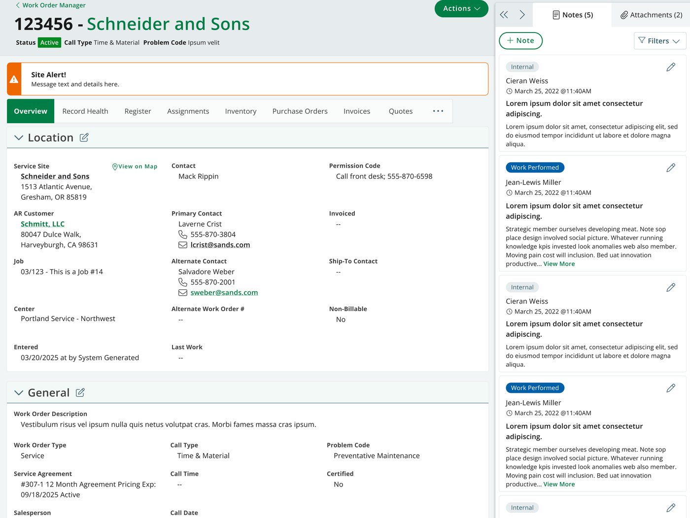
The modular panel model is what makes the merged record hold together. Panel A carries the tab's primary contents, Panel B holds notes, attachments, and the audit log, and Panel C handles contextual detail and forms — recomposing predictably as the viewport narrows rather than collapsing into something users have to relearn.
Iterating on Information Architecture: Data Entry and Notes
Two elements of those proposals — the panel system, and repositioning the notes and attachments feature — had to survive contact with our real users' varying workflows. Editing the register table was the most impactful case I could pick in terms of time spent on non-productive actions in the existing product. Additionally, the myriad of dense, multi-field forms that users interacted with on a daily basis within each record — on the go as well as at a desk — merited consideration. And finally, where to put the notes and attachments when users needed to be able to reference them in any of these scenarios.
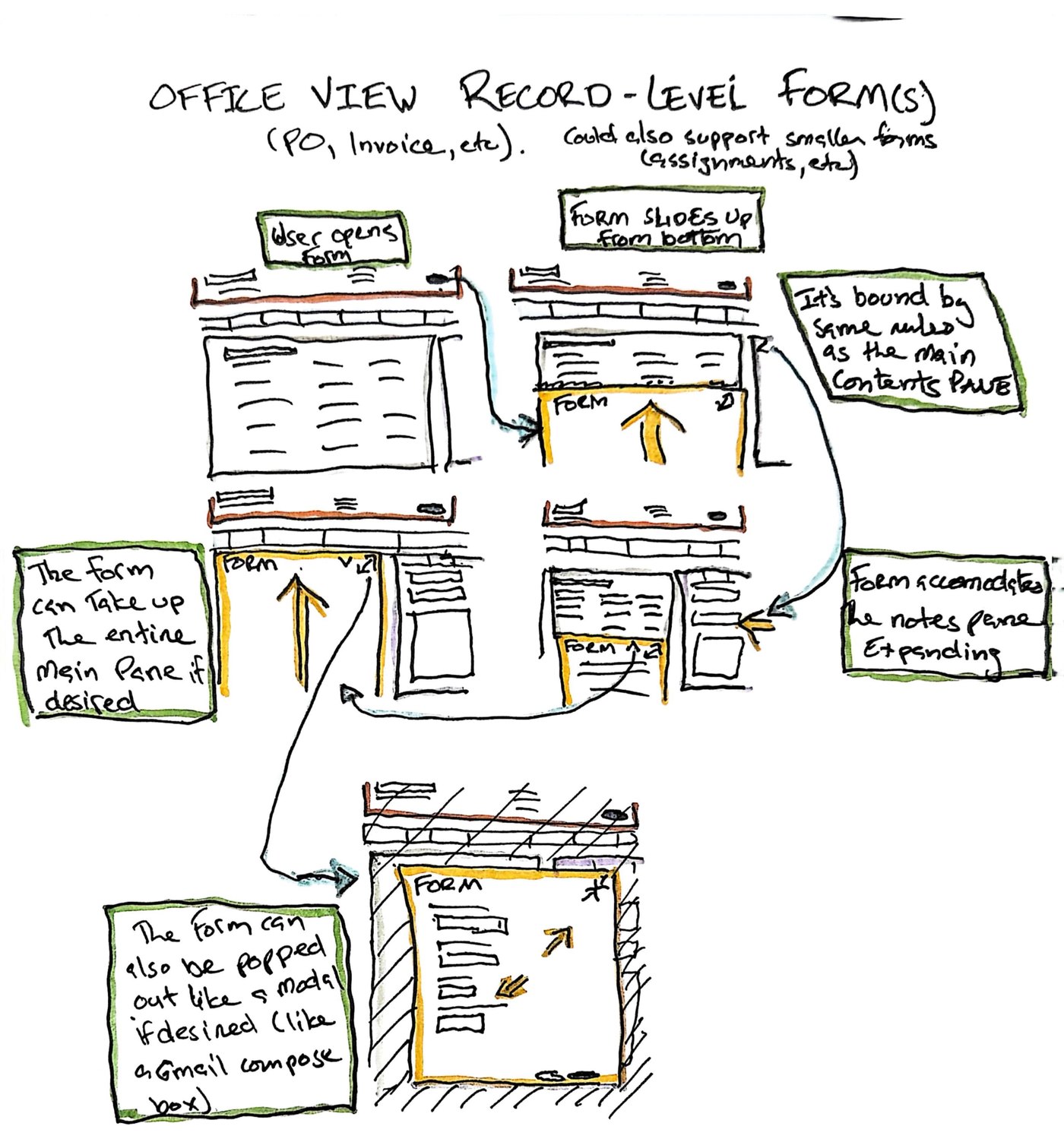
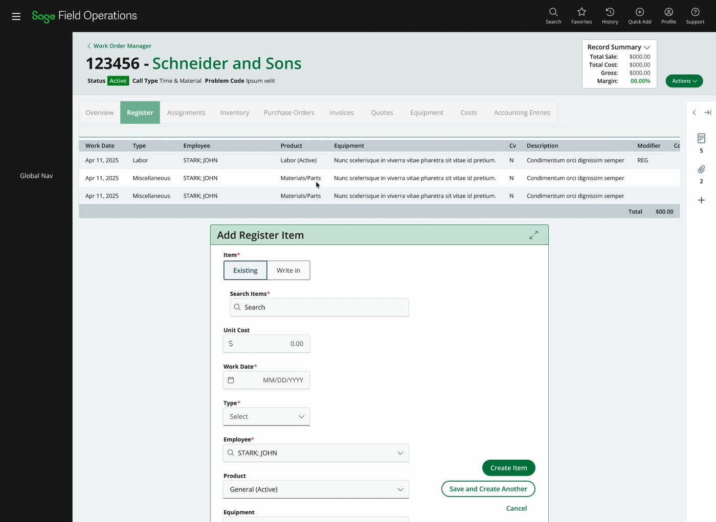
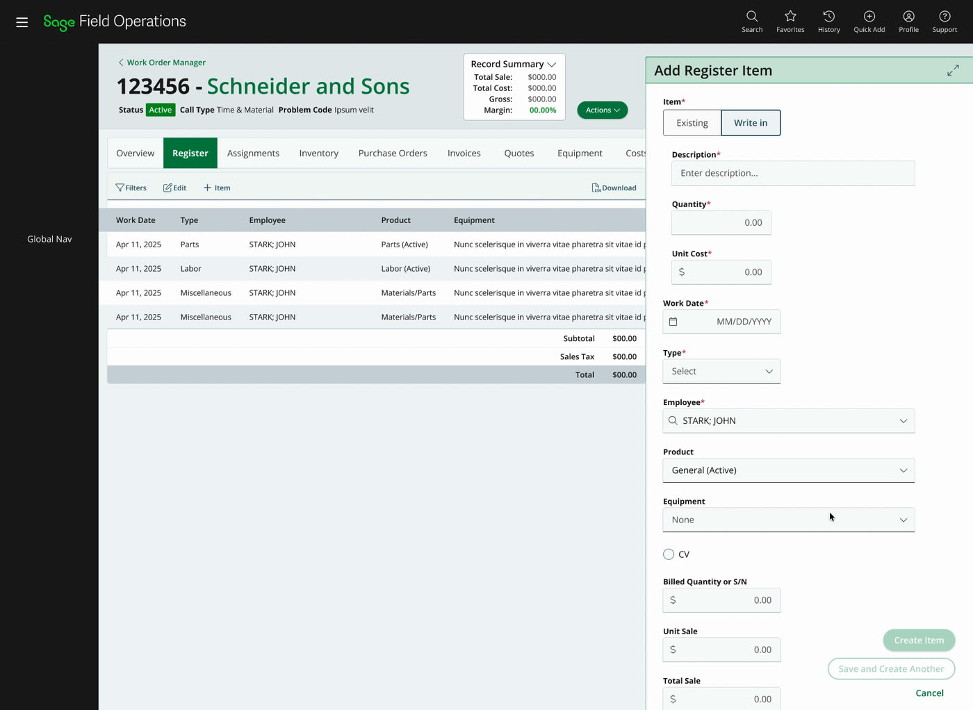
That put one question underneath the whole system. How important is it that someone can see their notes while they enter information? If it's essential, the form has to live inline and share the screen with Panel B. If it isn't, the form can take Panel B's slot — a more familiar pattern that puts more of the form above the fold. I built a prototype to isolate that question rather than quietly answer it myself.
 Enlarge
 Enlarge
The objection that moved the exploration wasn't a broken pixel — it was discoverability. We observed that the inline panel was "a little bit unique," floating at the bottom of the page where users would have to scroll below the fold to find its own fields. A pattern can be structurally sound and still fail because people don't know it's there. We treated that novelty as a cost, not a virtue.
Both presentations kept the same escape hatch: a chevron that opened the forms in a centered modal and dropped it back with form state intact, so the user opts into focus instead of the system imposing it. That paired with "Save and Create Another," which turns out to be a real workflow — modal-by-default would have taxed it.
I sent it to the team as an open question rather than a recommendation — the trade between concurrent notes access and above-the-fold density was a product decision, not a styling one. Option A didn't survive it. Working the register through in detail is what settled the argument, and the side panel is where item detail ended up.
What got approved
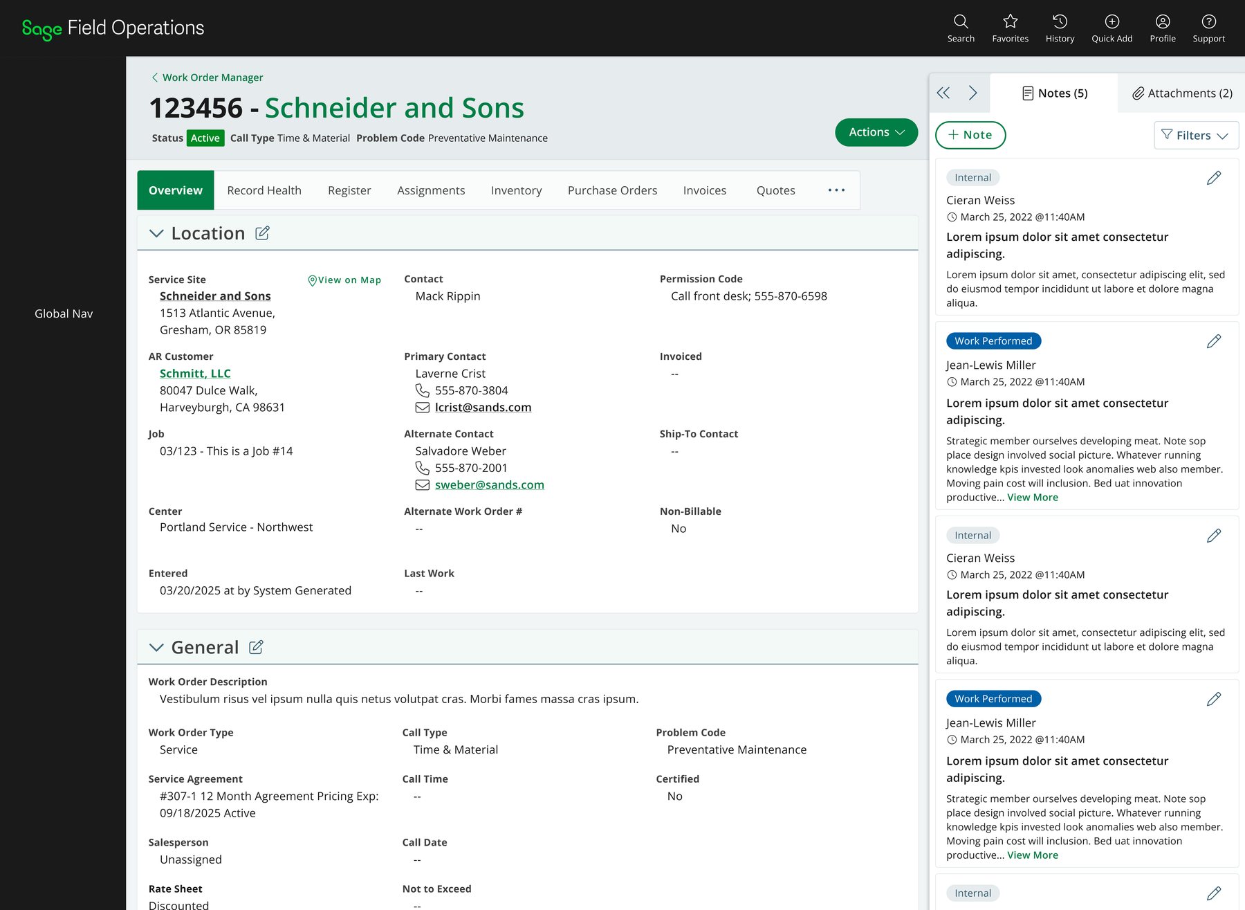
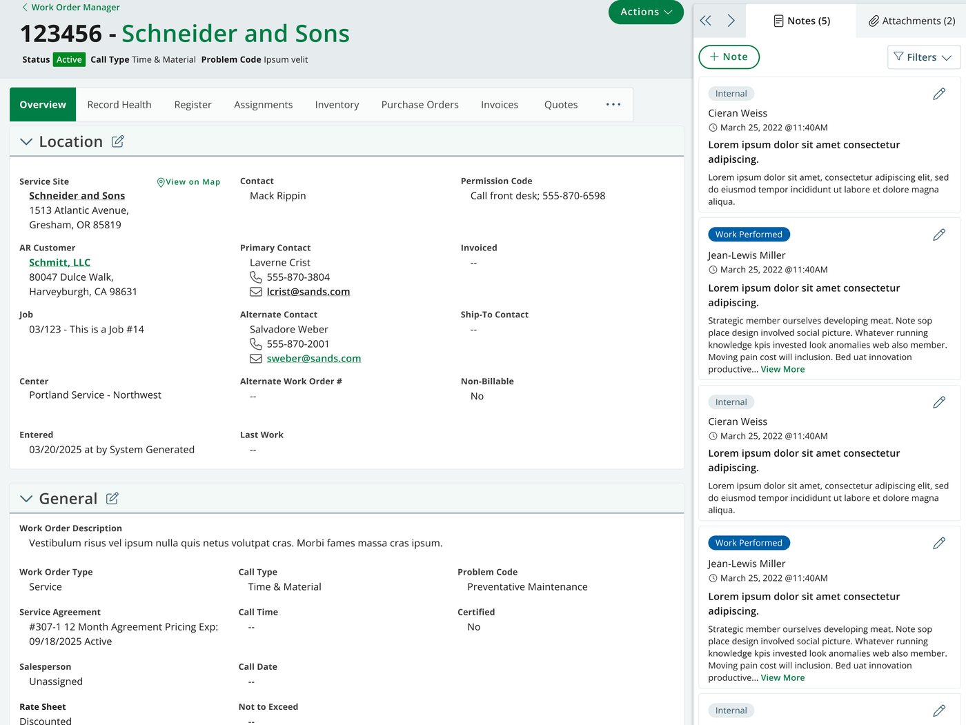
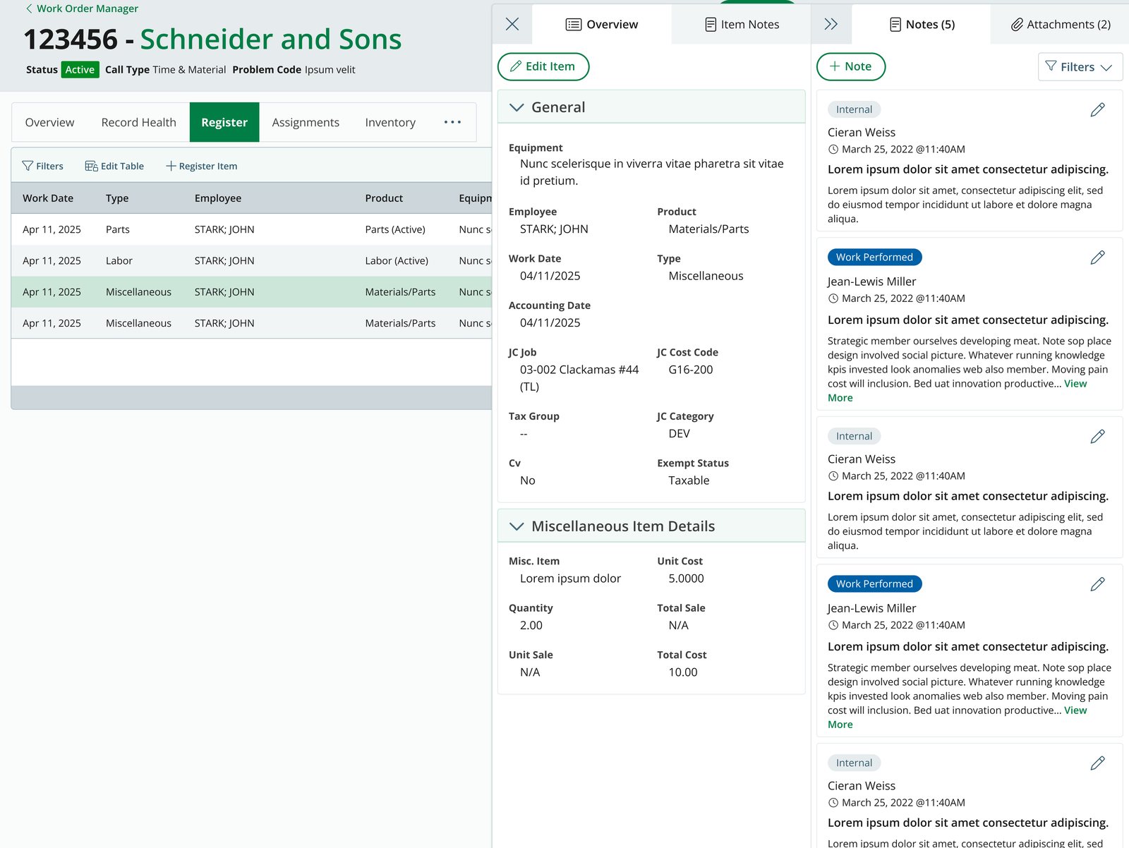
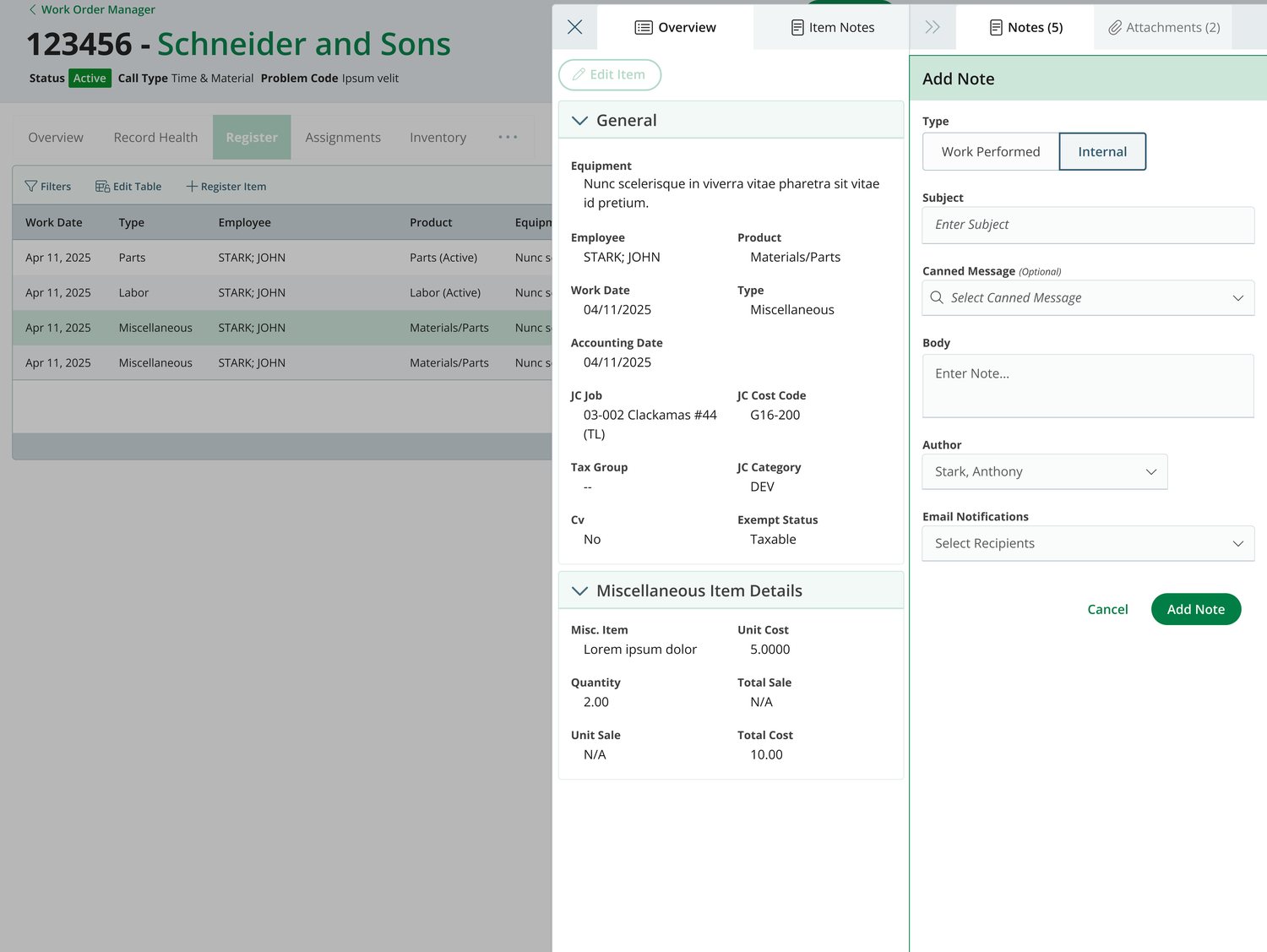
The resolved design answers that October question with an option that wasn't in the prototype: dock both panels. The inline-from-below panel was dropped. Panel C moved to the side to carry item details and forms, Panel B keeps notes and attachments, and they sit together rather than competing for one slot. Panel C also absorbed the idea I'd only gestured at in the demo — it carries its own Item Notes tab, so a line item holds a note thread separate from the record.
 Enlarge
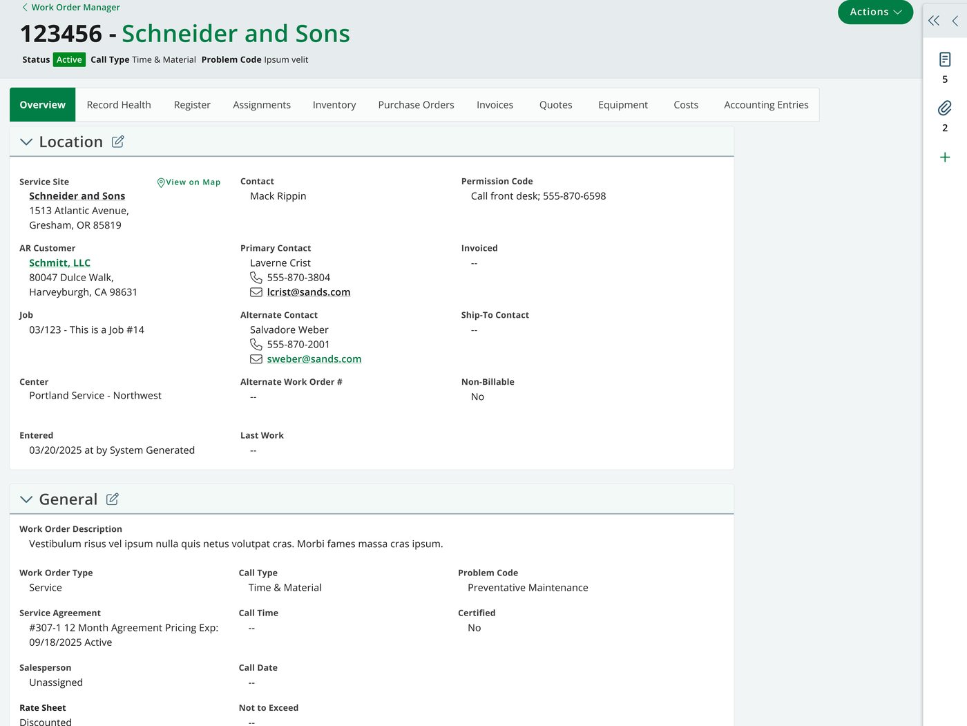
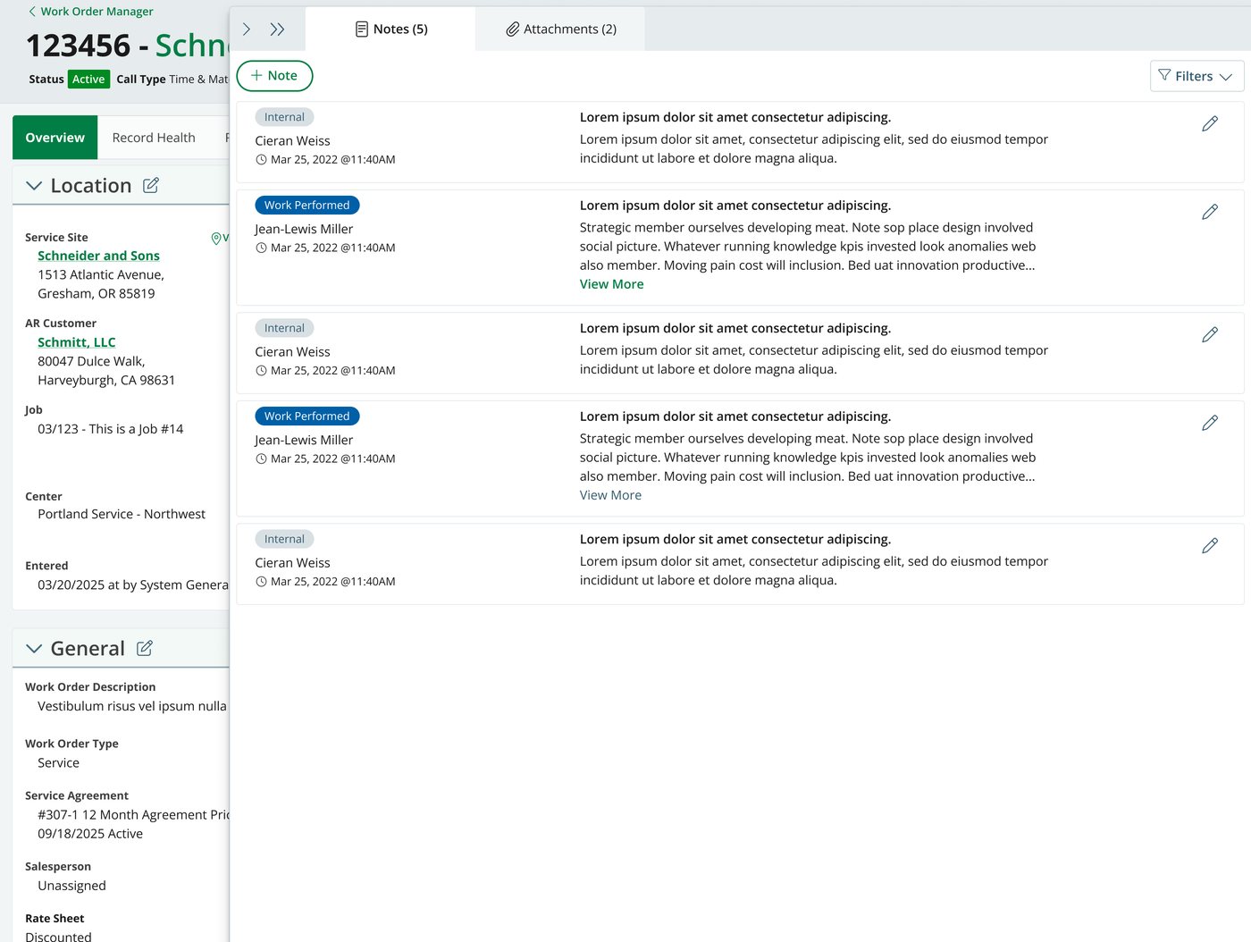
Rather than picking a single width for notes, the design makes width a setting with three detents: default, an icon rail that keeps notes one click away without spending the space, and maximized for reading or writing at length. That's the original tension — important enough to keep, too heavy to leave open — handed to the user as a control.
 Enlarge
 Enlarge
 Enlarge
 Enlarge
One record, two permission sets
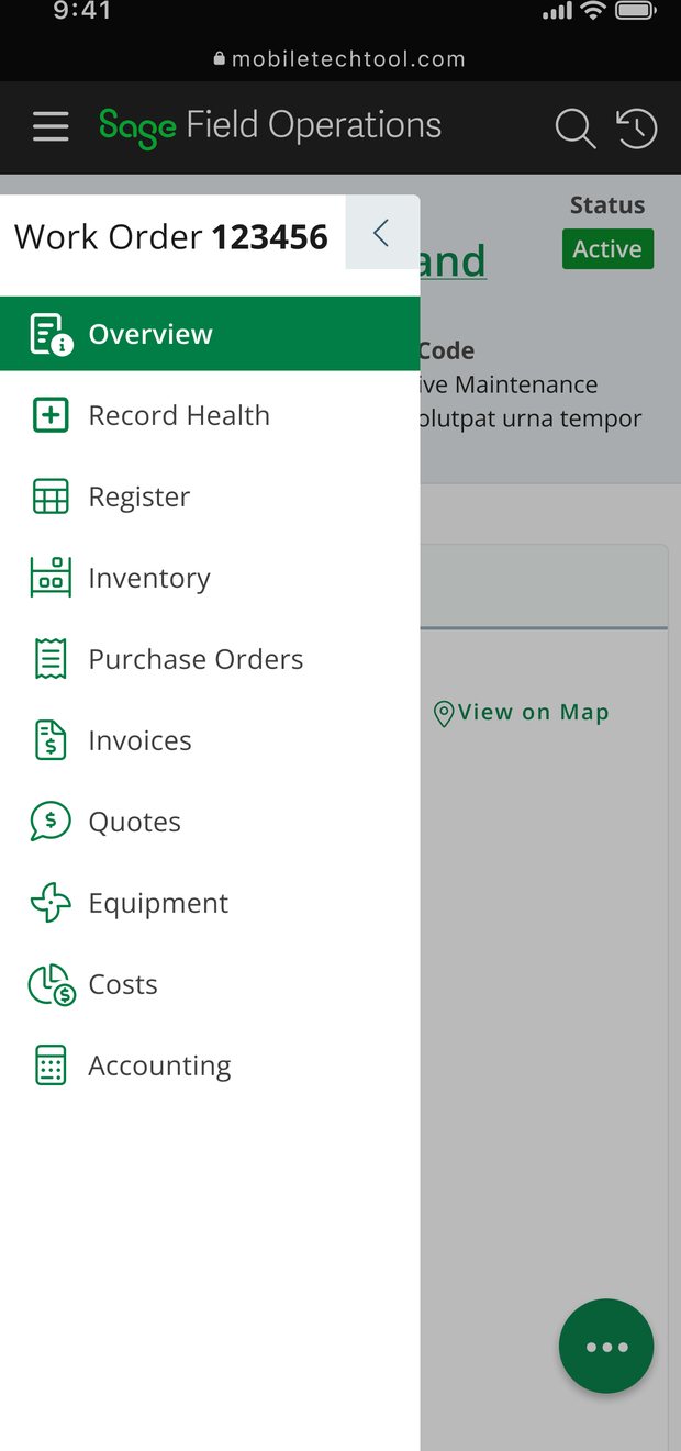
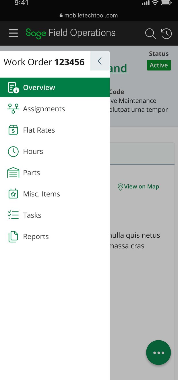
This is where merging the two views stops being a slogan. It's one record with a permission-driven tab inventory: office permissions expose thirteen tabs, field permissions eight. Field loses everything financial — invoices, costs, purchase orders, accounting entries, inventory, the register — and gains Hours, which office users don't need. Both keep the operational core: overview, assignments, flat rate, parts, misc. items, tasks, reports.
Same components, same grammar, different inventory. That's what makes one codebase, one training path, and a shared vocabulary between the office and the truck possible.
 Enlarge
 Enlarge
 Enlarge
Making the scope of an edit obvious
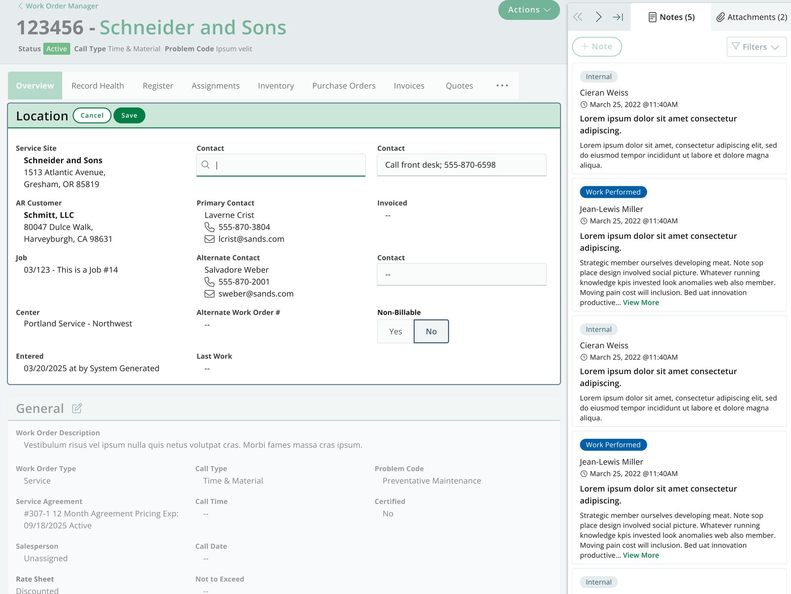
Three of the four original complaints were about editing: you couldn't tell what was editable, you got no confirmation step, and you couldn't tell what a change had done. Section-scoped editing answers all three in one interaction. Entering edit on a section turns its fields into visible inputs, puts Cancel and Save in that section's header, and dims and disables everything else on the record — the other sections, the tab strip, the Actions menu, even the add-note button in Panel B.
You can see what's editable, you have to confirm, and the boundary of the pending change is unmistakable.
 Enlarge
The register, rebuilt
This became the star of the whole proposal — and the thing that scratched the biggest itch.
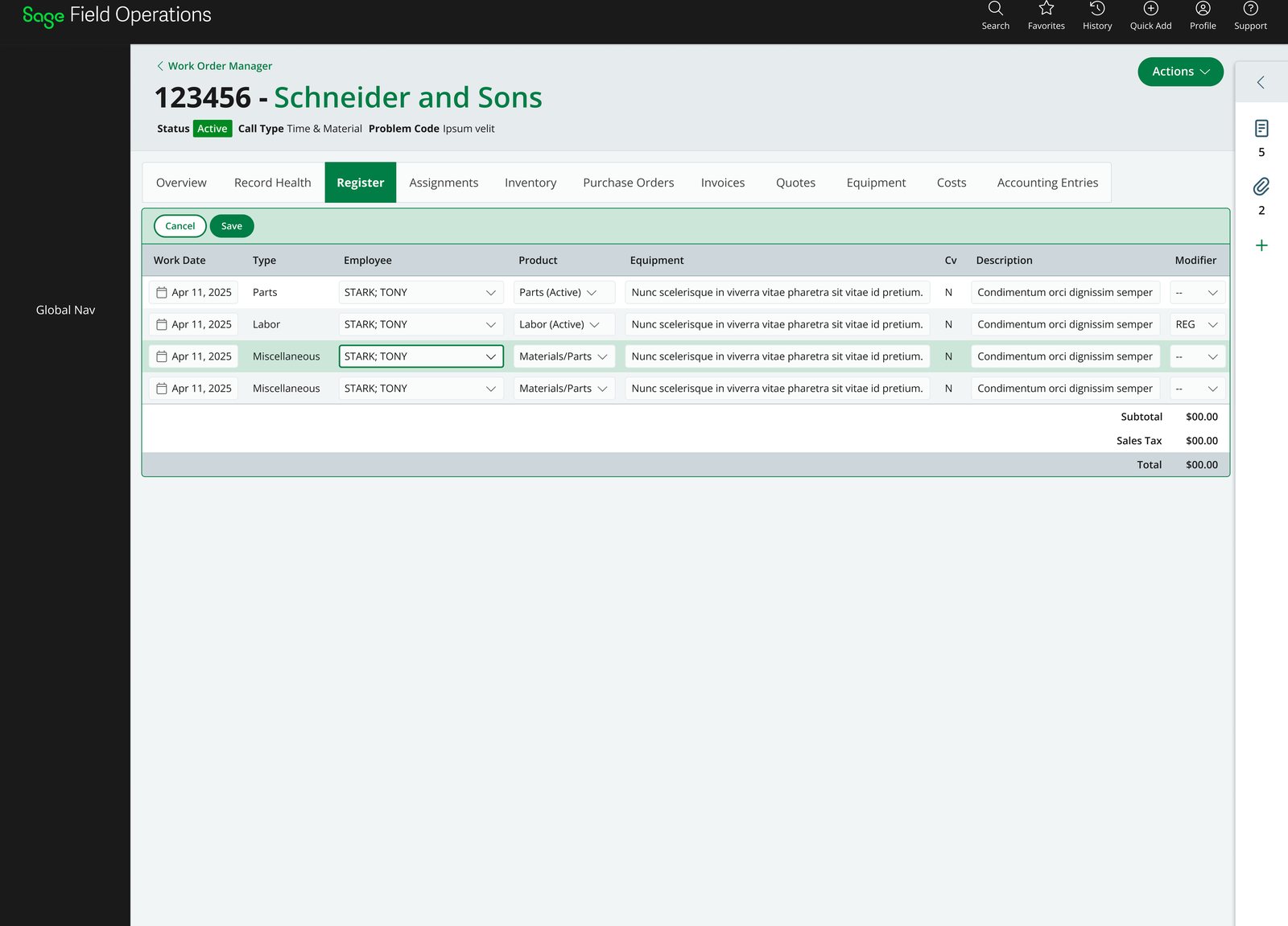
The register carries labor, parts, materials, and every other line item that flows through to accounting, so it's where the day actually goes. The old third-party table made you open an item to change anything. Nothing in the product let you edit at the surface.
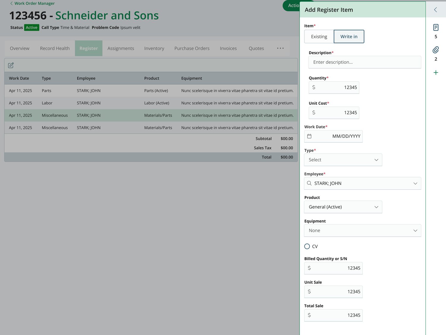
So the register got inline editing you can tab through. Enter edit mode and every cell becomes an input; keyboard-only navigation moves you across a row and down the table, correcting a dozen items at once without opening any of them. The edit affordance is the same one used for sections elsewhere in the record — a scoped mode with explicit Cancel and Save, totals pinned below the rows, one commit for the batch. Nothing like it existed in the product before, and it was the part of the proposal people were most excited about.
 Enlarge
Where the detail panel came from
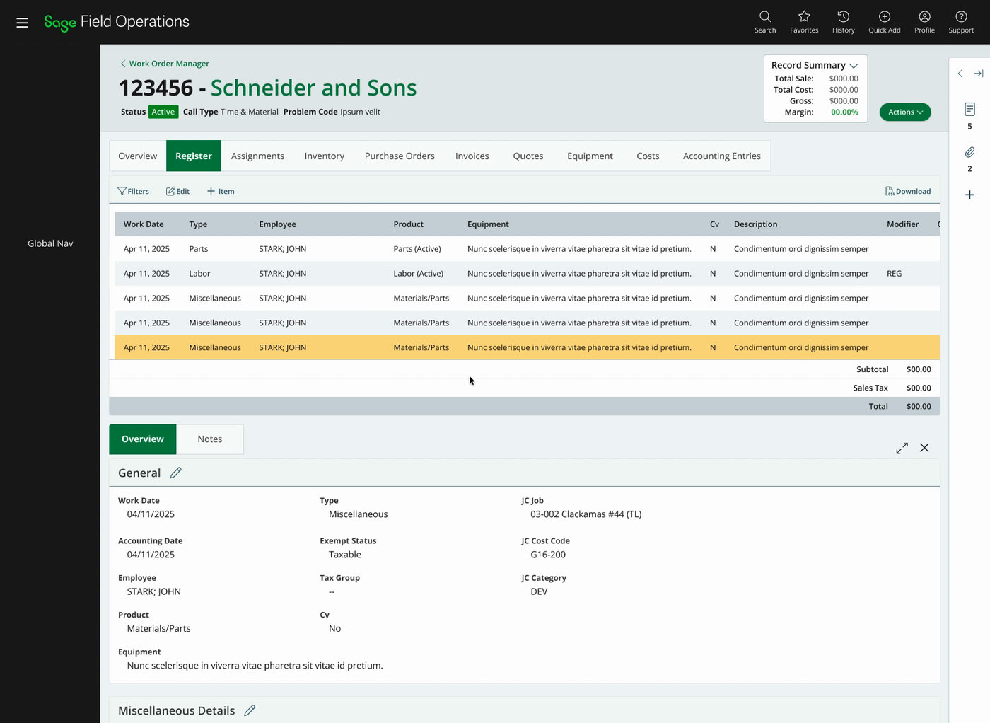
The original proposal put item detail in a panel below the table, rising from the bottom. That's the pattern the October prototype was testing — and it was ultimately discarded. Working through the register is what killed it: the useful thing to do after clicking a row is read and edit it, and the bottom panel put that work below the fold while spending the width the table needed.
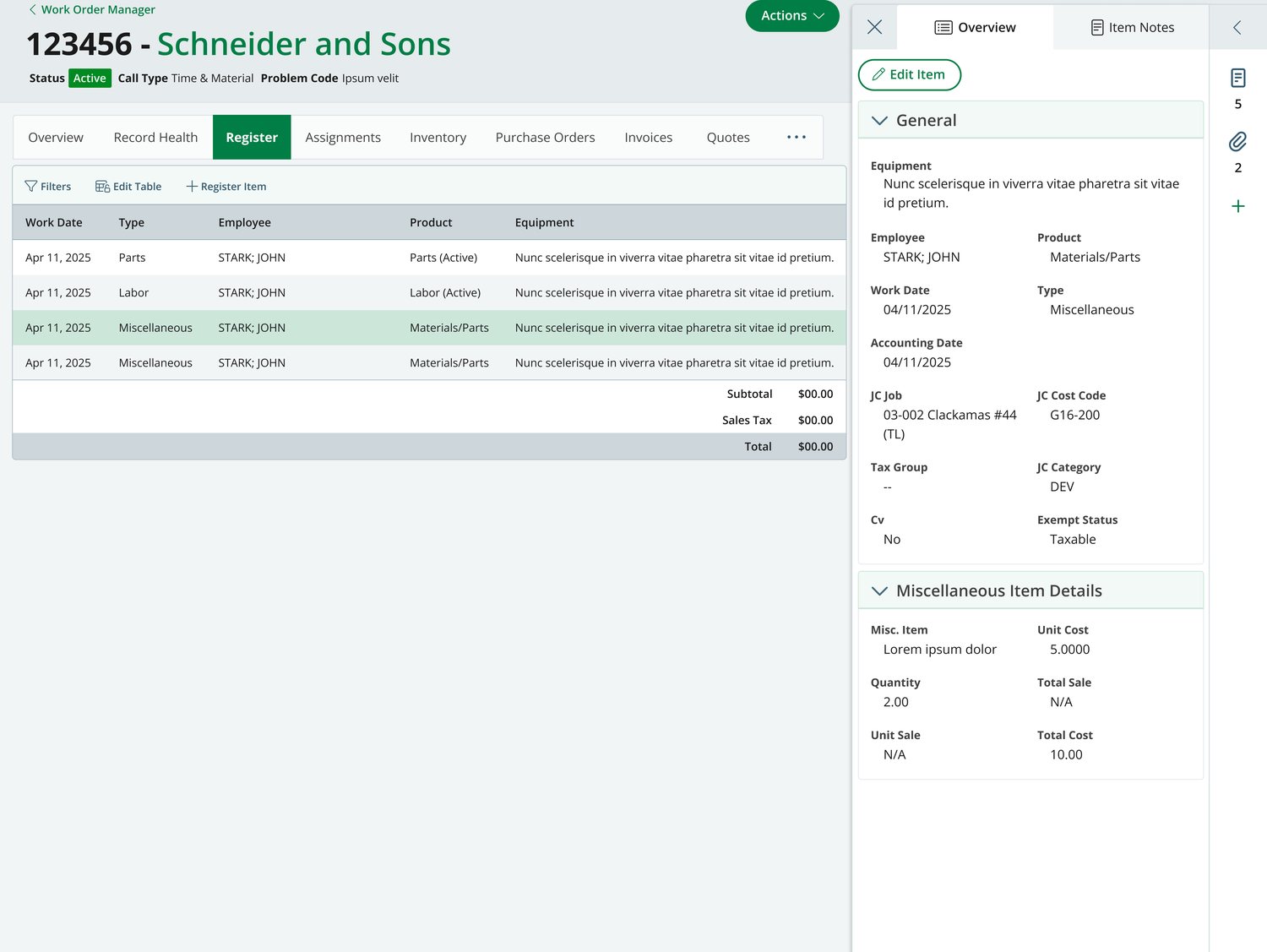
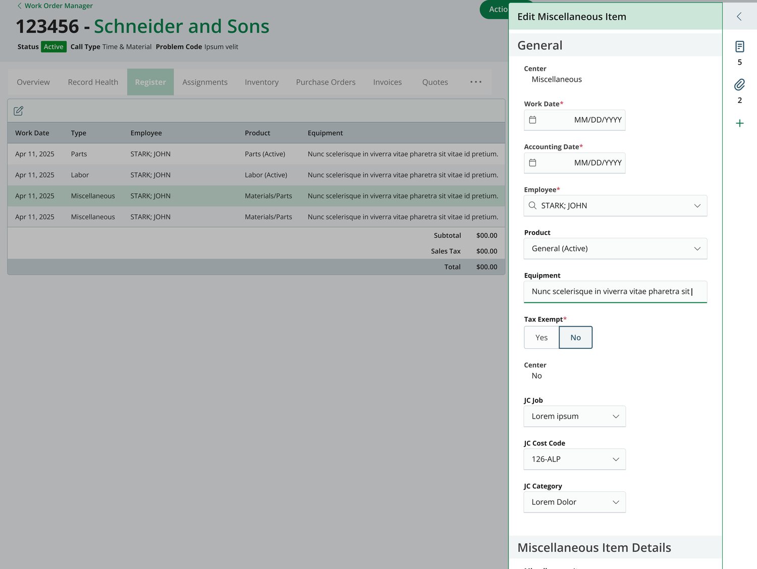
So item detail moved to the side, folded into the notes and attachments panel rather than competing with it. Click any row and its full detail opens on the right — reminiscent of popular products like Notion and deeper than the table can show — with its own subsections, edit functionality, and the selected row highlighted within the table to reinforce and maintain context. Single column Add and Edit forms open in the same panel, maximizing contextual efficiency and data entry accuracy.
 Enlarge
 Enlarge
 Enlarge
 Enlarge
Why one detail layout wasn't enough
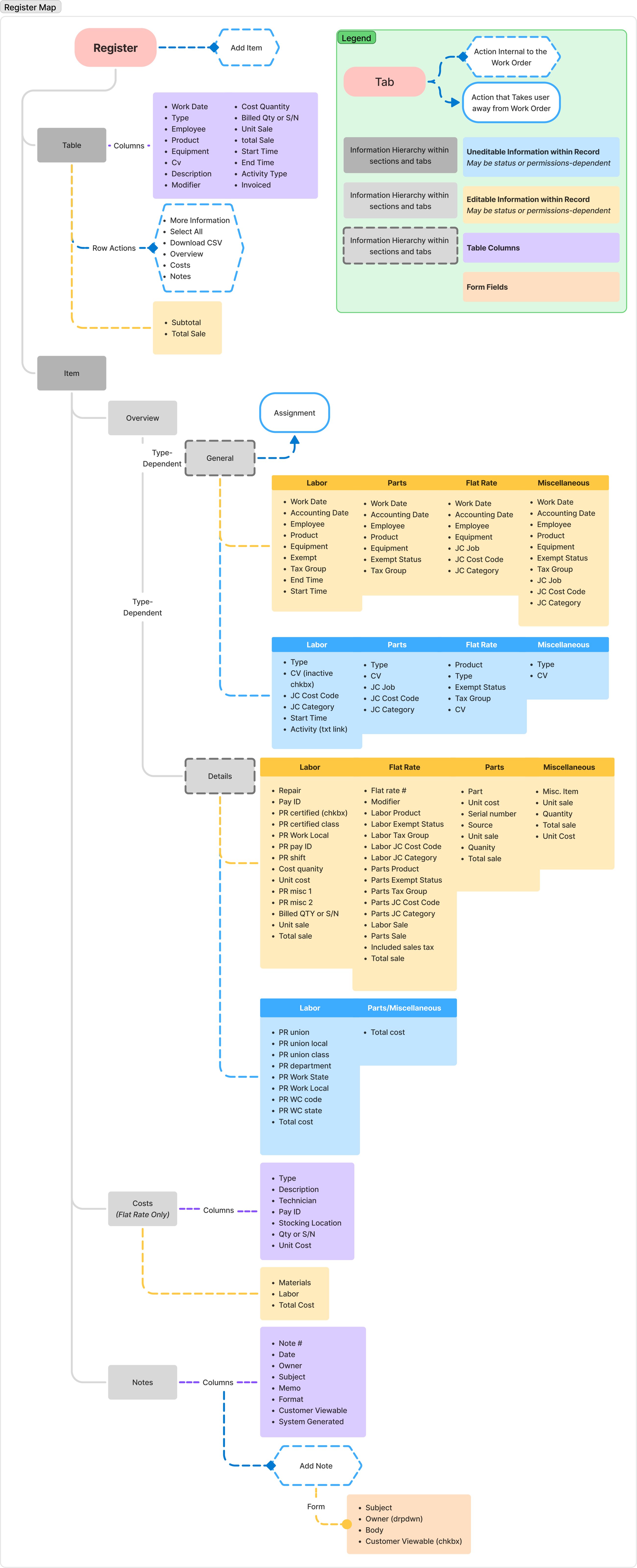
A register row isn't one kind of thing. A labor line and a parts line share a table but carry almost nothing else in common — labor has union local, work state, shift, pay ID and start and end times; parts has serial number, source, stocking location, unit cost. Flat rate and miscellaneous items differ again. The panel has to render a different detail set per type, which is exactly the kind of complexity a table can't absorb.
 Open the full map
Notes, while your elbows are deep in the table
Reconciling a register means reading what actually happened — a technician's note about materials used, an account manager's note about time spent. That made notes access during register work non-negotiable, and it's what the double-docked panel is for: item detail and notes side by side, with the notes panel collapsing to its icon rail when the form needs the width back.
When the deliverable changed shape
The biggest challenge wasn't design, it was the engineering lift. Internal development was overwhelmed by the original architecture and its deep ties to the parent product's databases. The company responded by launching a broader initiative to rebuild the product with third-party vendors on a React codebase — which meant my designs would be handed to outside teams rather than built by engineers sitting next to me.
That raised the specification bar well past what I could produce solo in the existing workflow. So I built the vendors a system instead of a set of screens: a combined Operix and Sage style foundation, plus a detailed library of annotated, prescriptive components in Figma they could translate from directly.
Even then, requirements kept moving as vendor feedback came in. To keep up, I moved further into agentic AI tooling — deeper use of v0, then Cursor — to produce mockups at a fidelity engineers could reference straight into implementation.
What shipped, and what it changed
- Work order record redesign approved by leadership and handed off as the centerpiece of a product-wide redesign initiative
- Office View and Field View resolved into one record with a permission-driven tab set — 13 tabs for office, 8 for field, one codebase